Guides

In brief
Explore Apple system fonts in SwiftUI, from SF Pro widths and weights to rounded and serif designs. Give your iOS app personality without adding a custom font.
You don’t need a custom font to give your iOS app personality.
Apple system fonts let you change the design, width, and weight of text, creating everything from friendly, rounded headings to bold, compressed headlines.
That’s a lot of flexibility before you’ve imported a single font.
My recommendation is to explore these built-in options first. You might discover that the look you’re trying to achieve is already available. The default font doesn’t have to look default.
Which Apple system fonts can you use in SwiftUI?
A system font is a built-in typeface your app accesses through Apple’s text APIs. On iOS, the default is SF Pro, part of Apple’s San Francisco font family.
But that’s only the starting point.
SwiftUI, Apple’s framework for building app interfaces, lets you select different system font designs. A font’s design is the overall shape and style of its characters.
Font design | Apple font | Look and feel | SwiftUI design value |
|---|---|---|---|
Default | SF Pro | Neutral and versatile |
|
Rounded | SF Pro Rounded | Softer and friendlier |
|
Serif | New York | Editorial and traditional |
|
Monospaced | SF Mono | Technical, with evenly spaced characters |
|
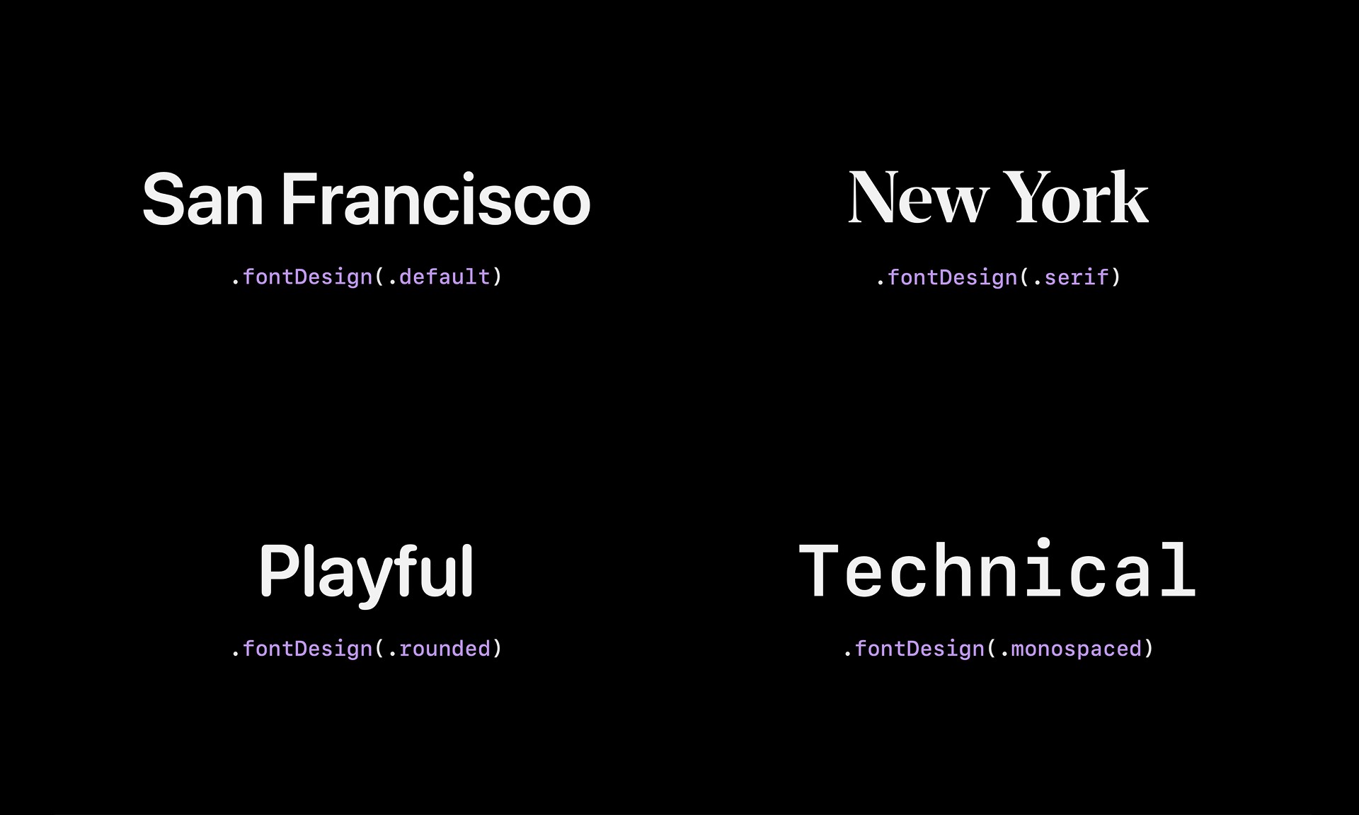
You change the design using SwiftUI’s font design modifier. For example, .fontDesign(.rounded) selects the rounded system design.
Rounded headings could give a habit tracker a friendlier feel. Serif text could make a reading app feel more like a publication. Monospaced text could suit a technical dashboard.
Fun fact: SF Mono is also used in coding environments such as Xcode.
These are different built-in designs, not four custom fonts you have to find and import. However, they don’t all offer identical width and weight options.

How does font width change your app’s typography?
Font width changes the horizontal proportions of the characters. It isn’t the same as increasing the font size or adding more space between letters.
SF Pro offers four widths: standard, condensed, compressed, and expanded.
With SwiftUI’s font width modifier, you can apply a treatment such as .fontWidth(.expanded) while keeping the same font size and weight. Changing only the width can make the text feel like a completely different font.
Condensed and compressed: fit more without shrinking everything
A condensed headline can fit more characters on each line without forcing you to reduce its size. Compressed takes that further, with tighter proportions that can give a headline a strong, graphic appearance.
Imagine a large article title that wraps onto too many lines. Before making it smaller, try a condensed width. You may keep the impact of a large headline while using less vertical space.
Condensed can also help with text in a narrow column. But compressed text needs more caution, especially in longer passages. Apple specifically discusses that readability tradeoff in its San Francisco typography session.
Don’t compress everything just because more words will fit. Your text still needs to be a comfortable reading experience for the user.
Expanded: give short titles more presence
Expanded width moves in the opposite direction. It gives characters wider proportions, helping a short title occupy more horizontal space. That can work well for a section heading or a short label you want to feel more prominent.
These width treatments are SF Pro features. Switching to rounded, serif, monospaced, or a custom font won't give you the same width options.
Which font weights should you use?
Font weight describes how thick or thin the strokes of the characters appear.
SF Pro has nine weights: ultralight, thin, light, regular, medium, semibold, bold, heavy, and black. Here, “black” means the heaviest weight, not the text’s color. Check out the Human Interface Guidelines Typography section for more details
SwiftUI’s font weights let you adjust that emphasis with a modifier such as .fontWeight(.semibold).
You don’t always need to make something bigger to make it stand out. A semibold section title can create contrast against regular body text without a dramatic size change.
Start with a small, consistent selection. Regular body text, semibold section headings, and a bold main title may be all you need. Having nine weights available doesn’t mean your screen needs to use all nine.
How do you combine fonts without making your app chaotic?
The point of all this variety is to create visual hierarchy, not to demonstrate every font option on one screen. Visual hierarchy tells the reader what to notice first, what comes next, and what’s supporting information.
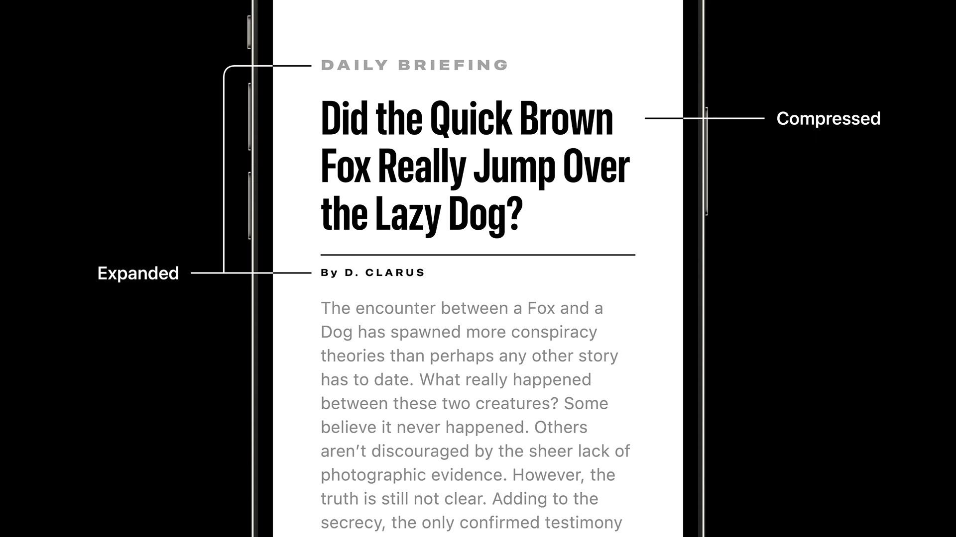
Apple’s WWDC22 typography session demonstrates this with a News layout. A bold, compressed headline gets the attention. Expanded supporting text provides contrast. The body text stays more neutral.
Size, weight, width, and color work together. You don’t need several unrelated fonts to create that separation.
Think of expressive typography like a volume control. Standard-width text in a regular weight speaks naturally. More extreme widths and weights speak louder.
That louder voice can be great for a headline. It’s usually less helpful when every paragraph is competing for attention.
A good starting point is to choose one expressive headline style, one supporting heading style, and a neutral body style. Reuse those treatments throughout your app.
You can also use color to make supporting information quieter, but don’t confuse quieter with hard to read. Lighter text still needs enough contrast against its background.
For the bigger picture, our Human Interface Guidelines guide explains how to use Apple’s design guidance without feeling like you need to memorize the whole thing.
Do system fonts handle accessibility and localization automatically?
Apple’s built-in fonts give you a strong starting point. They don’t remove your responsibility to build and test an adaptable interface.
Dynamic Type needs scalable text styles
In SwiftUI, use semantic text styles such as .body, .headline, and .title. These describe the text’s role rather than specifying only a fixed point size.
For example, .font(.body) uses a text style that scales with the user’s Dynamic Type setting. Apple explains how system fonts and text styles work together in The details of UI typography.
Simply choosing a fixed-size system font doesn’t provide the same behavior. A font created with .system(size: 24)doesn’t automatically become scalable just because it’s a system font.
You also need to check your layouts. Text can grow, but a fixed-height container may still clip it. Test larger accessibility text sizes, Bold Text, narrow screens, and text contrast. Let content wrap and layouts adapt rather than shrinking everything back down to preserve your original design. Apple’s typography guidelines are a useful reference.
Language support isn’t automatic translation
Apple also provides script-specific font families, including SF Arabic and SF Arabic Rounded, designed to work alongside San Francisco.
That helps with multilingual typography. It doesn’t translate your app’s words or guarantee identical font treatments across every writing system.
You still need translated content and layouts that work with longer strings and right-to-left languages.
The benefit is that Apple has already done substantial typography work for you. Take advantage of it, then test the actual experience you’re building.
How do you prompt an AI agent to style fonts correctly?
Knowing what the fonts can do is half the job. Knowing how to ask for it is the other half.
“Make this title wider” leaves a lot open to interpretation. An agent might increase the font size, add space between letters, or change something you didn’t intend.
Try prompts like these.
For stronger section headings
Make the section titles bold with an expanded font width.
For a friendlier interface
Use the rounded system font design for habit names and progress headings. Keep descriptions in the default font design with a secondary color and regular weight.
For an editorial article screen
Give the article headline a bold, compressed font width. Use standard-width body text. Preserve Dynamic Type and let the headline wrap when someone uses a larger accessibility text size.
These prompts specify the design decision instead of asking the agent to guess what “better” looks like.
Precise terminology doesn’t guarantee a perfect result, so review what the agent produces. But it gives you a much clearer way to explain the change you want.
Frequently asked questions about Apple system fonts
Do I need to download SF Pro to use it in an iOS app?
No. Your app can access the built-in font through SwiftUI’s system font APIs. You don’t need to import an SF Pro font file just to display standard system text.
When does a custom font make sense?
A custom font can make sense when you have a specific branding requirement or a visual direction the system fonts can’t achieve.
Custom fonts can also support Dynamic Type. SwiftUI provides custom-font scaling APIs, so accessibility isn’t exclusive to system fonts.
I'm not recommending that you never use a custom font. My recommendation is to make sure you can't get what you need from all the system font variations before adding it. Adding a custom font requires extra work to get all of the capabilities of the system font.
Give the system font a chance
Apple system fonts give you far more than one default look. Start with readable body text. Pick an expressive treatment for your headlines. Use width, weight, and design deliberately, then test larger text sizes and your supported languages.
You might already have everything you need to give your app personality.

Try Bitrig
Bitrig is an AI development environment focused on building native Swift apps for Apple platforms. Because it specializes in Swift, SwiftUI, and Apple’s first-party frameworks, it has a deep understanding of Apple's system fonts and everything they are capable of. Try it out today on your existing app or start a new one!
Topics
Developer Workflow
Design
SwiftUI

