Guides

In brief
Apple’s Human Interface Guidelines (HIG) are its free design reference for every Apple platform. How beginners use it, without reading the whole thing
If you want your app to look and feel like it belongs on an iPhone, iPad, Mac, Apple Watch, or Vision Pro, one of the best resources you can use is completely free.
Apple’s Human Interface Guidelines, commonly called the HIG, are Apple’s official design guidelines for building apps and experiences across its platforms.
And design means a lot more than making your app look pretty.
A well-designed app should be intuitive. Navigation should feel natural. Buttons and toolbars should be where people expect them. Text should be readable. The interface should adapt to different devices and accessibility settings. And your app should behave like the other apps people already know how to use.
The Human Interface Guidelines cover all of that.
You definitely don’t need to memorize them. Think of the HIG as a giant reference manual you can come back to whenever you’re designing a specific part of your app.
What are Apple’s Human Interface Guidelines?
The Apple Human Interface Guidelines are a collection of design principles, recommendations, examples, and platform-specific best practices for building software for Apple devices.
They cover everything from broad questions like how an iPhone app should be organized to extremely specific topics like how drag and drop should behave in a Mac app.
Apple currently organizes the HIG into several major areas:
HIG area | What it covers | When you might use it |
|---|---|---|
Getting Started | Design principles and platform-specific guidance | When starting an app or adding support for another Apple platform |
Foundations | Accessibility, app icons, color, layout, materials, typography, and other fundamentals | When establishing the visual foundation of your app |
Patterns | Common experiences such as drag and drop, onboarding, search, settings, and notifications | When designing how a particular feature should behave |
Components | System interface elements and controls | When deciding how to structure navigation, toolbars, menus, buttons, and other UI |
Inputs | Ways people interact with your app | When supporting touch, keyboards, pointers, game controllers, Apple Pencil, and more |
Technologies | Apple technologies and platform features | When integrating specific Apple capabilities and services |
That scope is what makes the HIG so useful.
You can be building a basic iPhone app, a complicated Mac productivity app, a widget, or an experience for Apple Vision Pro and find guidance relevant to what you’re working on.
Design is more than making an app look good
A mistake I see a lot of beginner developers make is treating design as decoration.
They pick some colors, round the corners, add a few gradients, and think the design is done. But visual style is only one part of design.
Design also includes questions like:
Can someone figure out how to navigate the app without being taught?
Is the primary action obvious?
Are controls placed where users expect them?
Does the app work with larger text sizes?
Does it still make sense in Dark Mode?
Is important information communicated with more than color?
Does an iPad or Mac version actually take advantage of the larger screen?
Do interactions behave like people expect on that platform?
Those decisions often have a much bigger impact on how polished your app feels than choosing the perfect shade of blue.
That’s why the HIG is so valuable. It helps you understand not just what Apple apps look like, but why they work the way they do.
For example, check out our guide on designing with Liquid Glass.
You do not need to read the entire HIG
When you first open the Human Interface Guidelines, the amount of information can be a little overwhelming. Don’t try to read the whole thing from beginning to end. Treat the HIG like documentation.
If you’re working on navigation, look up navigation. If you’re adding widgets, read the widget guidance. If you’re building a Mac app, review Apple’s macOS design recommendations. If you’re adding drag and drop, go directly to that section.
The goal is to know the HIG exists and build the habit of checking it when you’re making design decisions.
How should you use the Human Interface Guidelines?
A simple workflow is to consult the HIG whenever you begin designing a new feature or encounter an interface decision you’re unsure about.
1. Start with the platform you are designing for
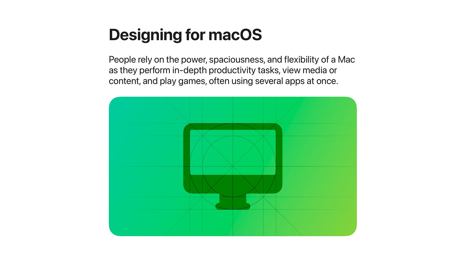
An iPhone app shouldn’t simply be a tiny version of a Mac app, and a Mac app shouldn’t just be a giant iPhone interface. Different devices have different screen sizes, input methods, and usage patterns. Take macOS as an example.
Apple recommends taking advantage of larger displays by showing more information with fewer nested levels. Mac users also expect resizable windows, keyboard shortcuts, menus, and precise pointer input.
Compare that with an iPhone. Screen space is limited, people primarily interact with their fingers, and navigating between screens is much more common.
The content might be the same, but the design should adapt to the platform.
2. Look up the specific feature you’re building
Once you understand the platform, search the HIG for the exact feature or interaction you’re working on.
Imagine you’re adding drag and drop to a Mac app.
You can go directly to Apple’s drag-and-drop guidance and find recommendations specific to macOS. For example, Apple suggests considering whether users should be able to drag content from your app into the Finder.
It also recommends allowing people to drag selected content from an inactive window without first activating that window.
Those are tiny details, but they’re exactly the kind of details that make a Mac app feel like a real Mac app. You probably wouldn’t think about all of them on your own.
3. Use Apple’s examples to understand the recommendation
One thing I really like about the HIG is how visual it is. You’ll often find screenshots, diagrams, animations, and interactive examples showing how a particular component or experience is supposed to work.
That matters because design guidance can get abstract quickly. Seeing a correct and incorrect example next to each other is usually much easier to understand than reading a paragraph describing the difference.
When you’re unsure about a design choice, don’t just scan the heading. Look at the examples.
Accessibility should be part of your design from the beginning
If accessibility is something you haven’t spent much time thinking about, the Human Interface Guidelines are a great place to start.
Accessibility isn’t a feature you bolt onto your app right before launch. It affects fundamental design decisions throughout the interface.
For example, Apple recommends supporting larger text sizes so your UI can adapt when someone changes their preferred text size with Dynamic Type.
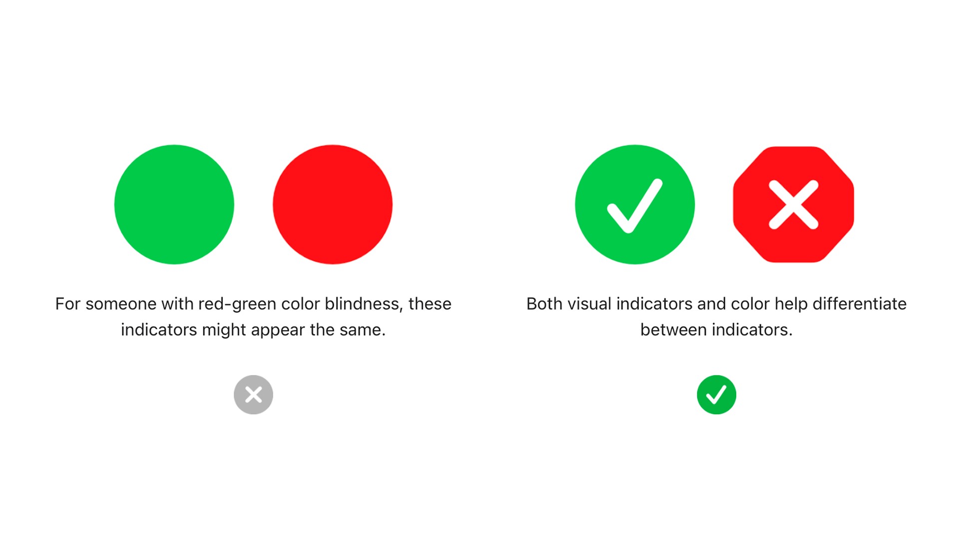
You also need sufficient contrast between text, icons, and their backgrounds, including in both light and dark appearances. And don’t use color as the only way to communicate something important.
Imagine displaying a successful state as a green circle and an error as a red circle. Someone who has difficulty distinguishing those colors may not be able to tell them apart.
Adding a checkmark and an X gives the user another way to understand the information.
Your app should also work well with system accessibility features such as VoiceOver.
These improvements don’t just help a small group of people. Clearer hierarchy, readable text, predictable interactions, and multiple forms of feedback tend to make the app better for everybody.
The HIG can help with surprisingly specific features
The value of the Human Interface Guidelines becomes obvious when you look at something like widgets.
A widget may seem like a small piece of UI, but there are a lot of decisions involved.
Apple provides guidance around topics such as:
Widget families and supported locations
Home Screen and Lock Screen widgets
StandBy
Interactive widgets
Text sizing
Color and contrast
Tinted and clear widget appearances
How much information a widget should contain
One of the bigger principles is that a widget should remain glanceable.
Even though widgets can contain interactive buttons and toggles, you generally shouldn’t try to recreate your entire app inside one. The widget should surface useful information or a simple action, while more complicated tasks stay inside the app.
That’s a perfect example of how the HIG goes beyond aesthetics. It helps define what the experience itself should be.
And if you want to add widgets to your app, Bitrig can do that for you.
Does following the HIG mean every Apple app has to look identical?
No.
The Human Interface Guidelines aren’t telling you to clone Apple’s apps or remove your own brand and personality.
Your app can still have custom colors, illustrations, animations, interactions, and visual identity. The important part is understanding the conventions people already know. A custom experience is much easier to use when familiar things still behave in familiar ways.
Your back button should behave like a back button. A toolbar should feel like a toolbar. Text should respond properly to system settings. Controls should be appropriate for the device someone is using.
Once you understand those conventions, you can make intentional decisions about when to follow them and when your app has a good reason to do something different.
How the HIG works with SwiftUI
If you’re building an Apple app with SwiftUI, using the system-provided components gives you a great starting point.
SwiftUI controls are designed to work with the platform and can automatically adopt many system behaviors and appearances.
That doesn’t mean SwiftUI magically gives you a beautifully designed app. You can still create confusing navigation, poor information hierarchy, inaccessible color choices, or an interface that feels wrong for the platform.
Think of SwiftUI as giving you the building blocks. The Human Interface Guidelines help you understand how those building blocks should be assembled.
That combination is one of the easiest ways to make a new app feel more at home on Apple devices.
A simple HIG checklist for your next app
You don’t need to turn app design into a massive process.
Before shipping a feature, ask yourself:
Have I checked the HIG for this component, pattern, or technology?
Does the design make sense for the specific Apple platform?
Am I using standard components where they make sense?
Does the interface work with larger text sizes?
Is there enough contrast in both light and dark appearances?
Am I communicating important information with more than color alone?
Do navigation and controls behave the way users already expect?
Have I tested the experience instead of judging it only from a static preview?
Run through that list as you build and you’ll catch a surprising number of design problems early.
Human Interface Guidelines FAQ
Do I have to follow Apple’s Human Interface Guidelines?
The HIG contains design guidance and best practices rather than a requirement that every app look identical. Following Apple’s conventions usually makes your app easier to understand and helps it feel more at home on the platform.
You can create custom interfaces, but deviations from familiar platform behavior should generally be intentional.
Are the Human Interface Guidelines only for iPhone apps?
No. Apple provides design guidance for its different platforms and form factors, including iOS, iPadOS, macOS, watchOS, tvOS, and visionOS.
The same feature may have different recommendations depending on the platform.
Are the HIG and App Review Guidelines the same thing?
No. The Human Interface Guidelines focus on designing great experiences for Apple platforms.
The App Review Guidelines are a separate set of technical, content, business, design, and legal criteria Apple uses when reviewing software for App Store distribution.
You should be familiar with both when you’re preparing to ship an app.
Should I read the entire HIG before building an app?
No. For most developers, the HIG is more useful as a reference.
Learn the basic design principles, then return to the relevant sections as you build specific features such as navigation, widgets, accessibility, drag and drop, or platform-specific interfaces.
Does using SwiftUI automatically make my app follow the HIG?
Not completely.
SwiftUI gives you system components and behaviors that provide a strong foundation, but you’re still responsible for decisions involving navigation, layout, hierarchy, accessibility, color, platform adaptation, and the overall experience.
Can I use the HIG when building an app with AI?
Absolutely. In fact, it can become even more useful.
AI can generate an interface extremely quickly, but that doesn’t automatically mean the result has good information hierarchy, sensible navigation, appropriate controls, or strong accessibility.
Use the HIG as a standard for reviewing what gets generated. Instead of saying, “make this look better,” you can be much more specific about the platform conventions and design principles you want the app to follow.
Build apps that feel at home on Apple platforms
If you’re new to app development, you don’t need to become a professional designer before you can build a polished app. You do need to learn what good Apple-platform design looks like and where to find answers when you’re unsure.
That’s what makes the Apple Human Interface Guidelines so valuable. Bookmark them, treat them like documentation, and check the relevant section whenever you build a new part of your app.

Try Bitrig
If you’re using AI to build your app, Bitrig is purpose-built for native Swift development on Apple platforms. It uses the full Xcode toolchain and is made by co-creators of SwiftUI, so you can build, test, refine, and ultimately ship native Apple apps without abandoning the technologies Apple provides.
Build your app with Bitrig, then use the HIG as one of your standards for making sure the finished experience feels like it belongs on an Apple device.
Topics
Apple Platforms
Design
SwiftUI

