
Guides

In brief
SF Symbols are much more than a collection of Apple icons. Learn how their variants, rendering modes, animations, localization, and SwiftUI integration can help you build better Apple-platform apps.
If you think SF Symbols are just a giant icon pack from Apple, you’re wildly underestimating them.
SF Symbols are Apple’s library of system icons designed specifically for apps on Apple platforms. They’re built to work alongside Apple’s system font and support different weights, sizes, colors, variants, animations, accessibility features, and localization.
As of 2026, Apple provides more than 7,000 symbols.
What are SF Symbols?
An SF Symbol is a vector-based symbol created by Apple for use on Apple platforms.
Because the symbols are part of Apple’s design system, they look at home beside standard controls, navigation bars, menus, labels, buttons, and text. They’re designed to feel like a natural part of an app on Apple platforms.
In SwiftUI, displaying an SF Symbol is simple:
The string heart is the symbol’s system name. SwiftUI asks the operating system for that symbol and displays it in your interface.
Apple provides a separate macOS app that lets you search the library for system names, preview animations, inspect variants, check operating system availability, and work with custom symbols.
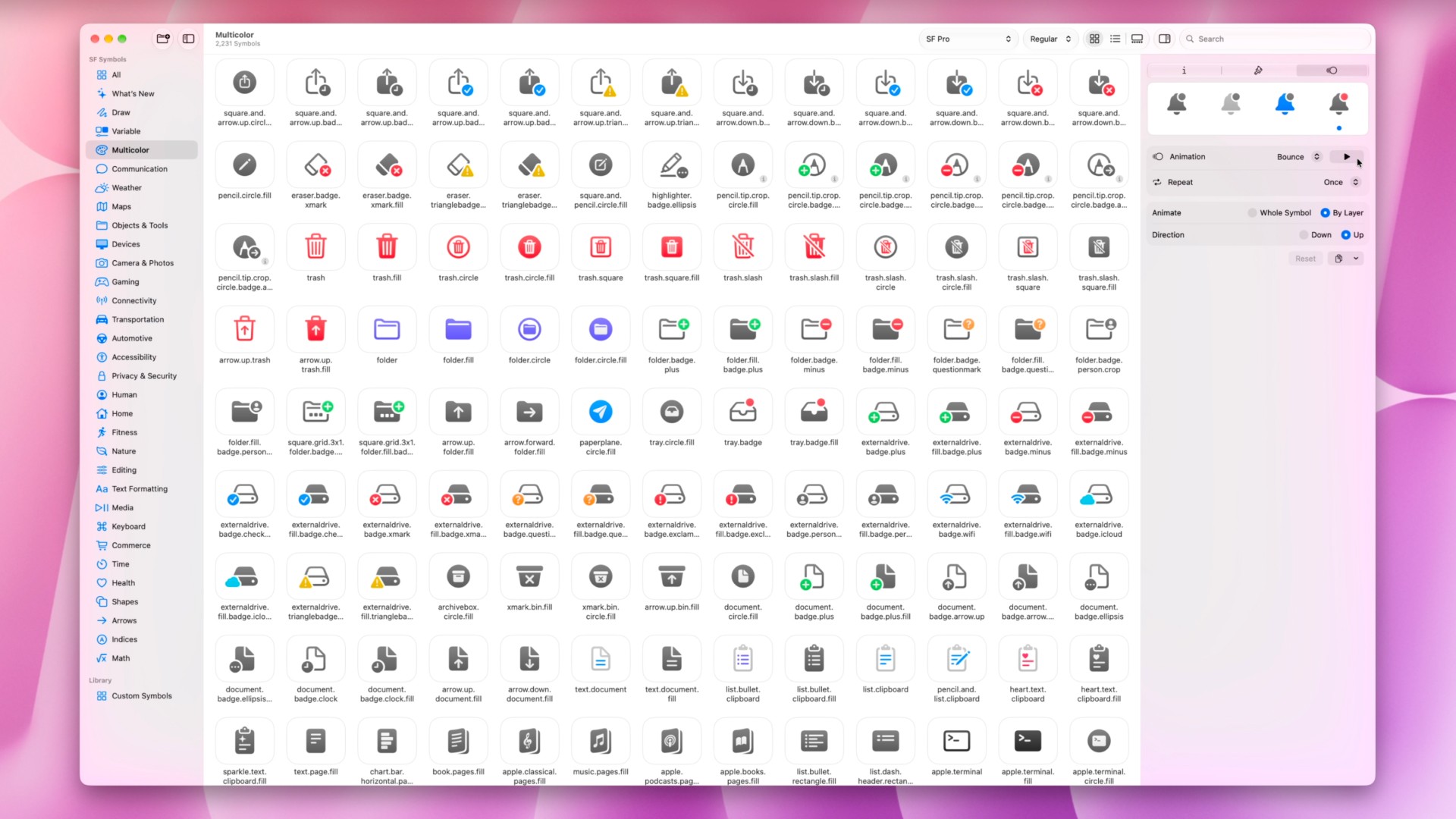
Why should you use SF Symbols instead of custom icons?
Custom icons still have a place, especially when you need something specific to your brand or product. But for common interface actions you can almost certainly find an SF Symbol that works for you. And using SF Symbols gives you tons of bonus features (more on that in a bit).
With a custom icon, you may need to:
Search the internet to find it
Purchase a license
Make sure it's the correct file format
Import it into your asset catalog
Create separate versions for different states
Adjust its size, weight, alignment, and color
Build any animations yourself
Check how it behaves in light mode and dark mode
SF Symbols do all of that for you. For free.
Consideration | SF Symbols | Typical custom icons |
|---|---|---|
Setup | Reference a system name in code | Find, license, download, and import assets |
Apple platform consistency | Designed specifically for Apple interfaces | Depends on the icon set |
Text integration | Supports matching weights and scales | Often requires manual sizing and alignment |
Variants | Many include fill, circle, slash, and badge versions | Usually requires separate assets |
Color and animation | Supports built-in rendering modes and symbol effects | Usually requires custom implementation |
Localization | Some symbols adapt to language and reading direction | Often requires separate logic or assets |
Accessibility | Integrates with Apple’s interface frameworks | Requires more manual configuration |
This doesn’t mean imported icons are always bad. They are just limited when compared to everything you get with SF Symbols.
SF Symbols also make your app easier to understand. Apple users already recognize familiar symbols for actions such as sharing, searching, deleting, playing media, and navigation. When you reuse that familiar visual language, users don’t have to stop and figure out what an unusual custom icon means.
Apple provides more detailed recommendations in its Human Interface Guidelines for SF Symbols. If you're not familiar with the HIG, you can check out our guide.
What can SF Symbols do?
They can change weight, display different variants, use multiple colors, animate individual layers, represent changing values, adapt to different languages, and transition between related states.
SF Symbols support variants
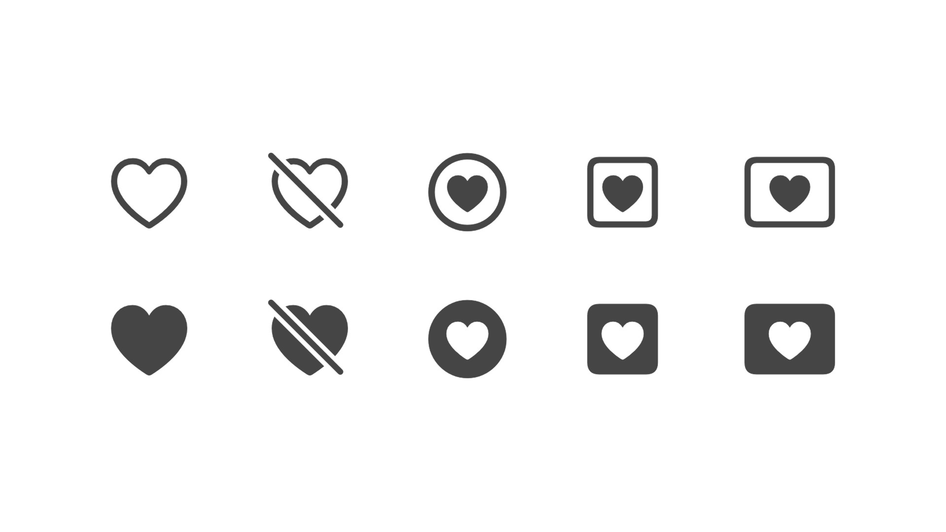
Many SF Symbols come in several related forms. For example, a heart might be available as:
heartheart.fillheart.circleheart.circle.fillheart.slashheart.slash.fill
These variants make it easy to communicate different states while keeping the icon visually consistent.
An outlined heart might represent an item that hasn’t been favorited. A filled heart can represent an item that has been favorited.
Other symbols may include square, circle, slash, badge, or directional variants. Not every symbol supports every variant, so use the SF Symbols app to see which options are available for the symbol you’re using.
SF Symbols can match the weight of your text
SF Symbols are designed to work alongside San Francisco, Apple’s system font (which also has a ton of capabilities you can learn about in our guide).
SF Symbols support multiple weights and scales, which allows an icon to sit naturally next to light, regular, semibold, or bold text. A thin symbol beside bold text might look out of place. With SF Symbols, you can adjust the symbol’s weight so the interface feels intentional and visually balanced.
Here’s a basic SwiftUI example:
Because the symbol is being used inside a Label, SwiftUI can align and size it alongside the text.
You can also apply a specific symbol weight when needed:
SF Symbols support multiple rendering modes
Rendering mode | What it does |
|---|---|
Monochrome | Displays the symbol using one color |
Hierarchical | Uses one color with different opacity levels to create visual depth |
Palette | Lets you assign colors to separate layers of the symbol |
Multicolor | Uses the symbol’s built-in colors when supported |

The default monochrome mode works well for many interface icons.
Hierarchical mode can add depth without introducing several unrelated colors. Palette mode gives you more control over individual layers, while multicolor mode uses Apple’s built-in color treatment for symbols that support it.
Here’s an example using hierarchical rendering:
iOS 26 and above also supports gradient color treatments. Because rendering capabilities can depend on the operating system, check your app’s deployment target before designing around a newer feature.
SF Symbols can animate individual layers
This is one of my favorite things about SF Symbols.
For example, when a fan symbol rotates, the blades can rotate while the outside frame remains still. A stopwatch can animate its dial without rotating the entire stopwatch. A ringing clock can wiggle the individual layers separately.
That layer awareness makes the animation feel much more delightful. Apple provides built-in symbol effects such as:
Bounce
Pulse
Scale
Wiggle
Rotate
Breathe
Variable color
Draw On
Draw Off

Exact support depends on the symbol, effect, framework, and operating system version. In SwiftUI, applying a symbol effect can require only one modifier:
For a real app, you’ll often want to trigger the animation when some state changes. Here’s a complete favorite button example:
When isFavorite changes, SwiftUI applies the bounce effect and updates the symbol from its outlined state to its filled state.
There’s still normal state and interaction code involved, but you don’t have to build the animation yourself.

Variable symbols can represent changing values
Some SF Symbols can visually represent a numeric value. This is useful when displaying things such as:
Wi-Fi signal strength
Speaker volume
Microphone input
Download progress
Battery level
Cellular signal
Instead of treating the symbol as a static image, you give it a value, usually between 0.0 and 1.0.
As the value changes, the symbol updates the appropriate parts of its design. Here’s an example:
Only symbols specifically designed for variable values support this behavior. You can inspect a symbol in the SF Symbols app to see whether variable value support is available.
Magic Replace animates related symbols
Magic Replace creates a smooth transition between two related SF Symbols.
Instead of removing one image and inserting another, the system identifies the visual parts the symbols share. It can preserve those shared elements while animating only the parts that changed.
This is useful for transitions such as:
A bell gaining a notification badge
A speaker gaining a slash when muted
A play symbol becoming pause
An icon changing between enabled and disabled states
In SwiftUI, a related symbol transition can be added using a symbol effect content transition:
The exact transition depends on the symbols, their relationship, and the operating system version. Not every pair of symbols will produce an elaborate transition, so preview the behavior and test it on the versions of iOS your app supports.
SF Symbols support localization
Some symbols automatically adapt to the user’s language and reading direction. This matters for languages that read from right to left.
For example, a symbol that means “forward” may need to point in a different visual direction depending on the language. A symbol that represents the absolute direction “right” should continue pointing right.
That’s why symbol naming matters.
Symbols described as forward and backward can adapt to the interface direction. Symbols described as left and right generally represent absolute directions.
Choose the symbol that matches the meaning of the action, not just whichever arrow looks right in English.
SF Symbols can make localization easier, but you should still test your interface in the languages and reading directions your app supports.
SF Symbols and accessibility
SF Symbols work well with Apple’s accessibility frameworks, but using a system symbol doesn’t automatically make an interface perfectly accessible.
Here, the button has a title of "Delete", but if we want VoiceOver to provide more detail we can add an accessibility label that clearly describes the action. In this example, VoiceOver will say "Delete photo", rather than just "Delete".
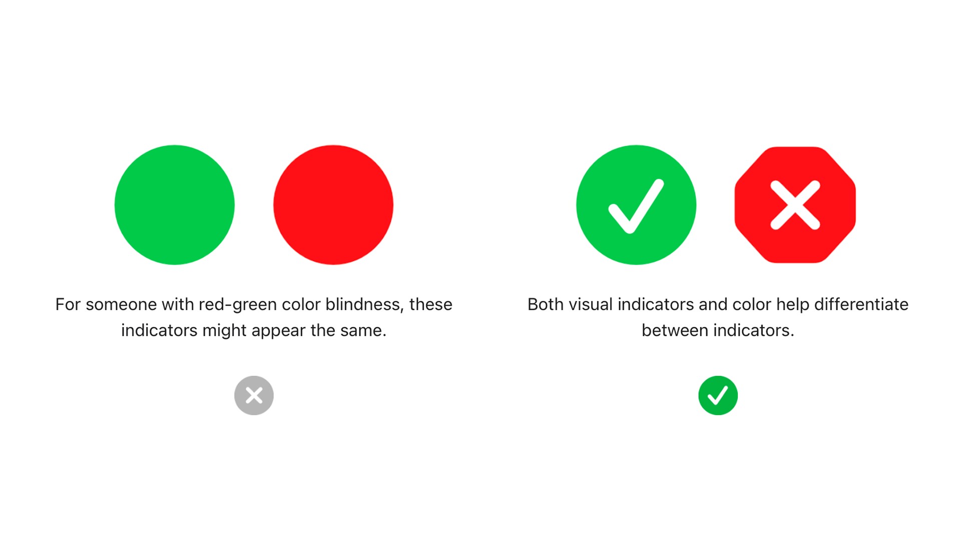
SF Symbols can help your icons communicate state without relying on color alone. Someone who can’t distinguish the colors should still be able to understand what the control does.
You should also test symbols alongside larger Dynamic Type sizes. A symbol that looks good beside normal-sized text may need different spacing when the user increases their preferred text size.
How do you find the right SF Symbol?
The free SF Symbols app is much faster than guessing symbol names from memory.
A practical workflow looks like this:
Search for the concept you’re trying to communicate.
Inspect related symbols and variants.
Preview rendering modes and animations.
Check whether the symbol supports variable values.
Check which operating system versions support it.
Copy the symbol’s system name.
Test it inside the actual screen you’re building.
Try searching for concepts rather than exact filenames.
For example, you might search for:
Favorite
Privacy
Upload
Progress
Navigation
Notification
Microphone
Camera
Download
Share
Once you find a symbol, inspect its variants before immediately adding it to your app. A filled, circled, slashed, or badged version might communicate your state better.
You should also test the symbol in:
Light mode
Dark mode
Larger text sizes
Different interface directions
Every operating system version you support
A newly added symbol may not exist on an older version of iOS. If you support older systems, provide a fallback instead of assuming every symbol is available.
How should you prompt an AI agent to use SF Symbols?
The biggest improvement you can make when working with an AI coding agent is to use Apple’s terminology. An AI agent can only work with the level of detail you give it.
A vague prompt might say:
When the user taps the heart, make it bigger for a little bit and then fill it in.
The agent now has several decisions to make.
Does “make it bigger” mean a normal SwiftUI scale animation or the SF Symbols bounce effect? Should the icon crossfade, use Magic Replace, or immediately switch states?
The agent might guess correctly, but probably not.
A stronger prompt would say:
When the user taps the heart SF Symbol to favorite a post, update it to it's filled variant, apply the bounce symbol effect and use the gradient rendering mode.
With that prompt, you'll get exactly what you want.
When prompting an AI agent, include these details when they matter:
The exact symbol name, if you know it
The state change, such as outlined to filled
The symbol effect you want
Whether the effect repeats or responds to an interaction
The rendering mode
The colors or visual hierarchy
The important part is understanding what the system can do and knowing enough terminology to describe the result you want.
Terms such as symbolEffect, bounce, wiggle, variableValue, palette, hierarchical, Magic Replace, and contentTransition give your AI agent much more useful direction than saying, “Make the icon do something cool.”
Can you create custom SF Symbols?
Yes. If Apple’s library doesn’t contain the symbol you need, you can create a custom SF Symbol.
Apple lets you export a symbol template, edit the vector artwork using a compatible design tool, and import the result back into the SF Symbols workflow.
A properly constructed custom symbol can support system characteristics such as:
Multiple weights
Multiple scales
Rendering layers
Accessibility
Variable behavior
Symbol effects
Those capabilities aren’t automatic.
To support multiple weights, rendering modes, variable values, or layer-aware animations, the artwork must be structured and annotated correctly.
Creating a basic custom symbol is approachable. Creating one that supports all the advanced behaviors of Apple’s system symbols requires more design skill and testing.
Start by searching Apple’s existing library. Create a custom symbol when your app needs a product-specific concept that Apple doesn’t already represent.
Frequently asked questions about SF Symbols
Are SF Symbols only available in SwiftUI?
No. SF Symbols can be used with SwiftUI, UIKit, and AppKit.
The exact API differs between frameworks, but the same system symbol library is available throughout Apple’s development platforms.
Do I need to download the SF Symbols app?
You don’t need the app just to display an SF Symbol in your code. However, the SF Symbols app is highly recommended because it makes it much easier to:
Search for symbols
Check their system names
Preview variants
Preview effects
Inspect rendering layers
Check operating system availability
Create custom symbols
Are SF Symbols free?
Apple provides the SF Symbols app as a free download.
Their use is governed by Apple’s license agreement. Review the current license if you plan to use symbols outside their normal role in Apple-platform interfaces, especially in marketing, branding, or content distributed outside an app.
Can I change the color of an SF Symbol?
Yes. You can apply colors using SwiftUI styling APIs and choose from rendering modes such as monochrome, hierarchical, palette, multicolor, and gradient.
The available appearance depends on the symbol and the rendering mode you select.
Can every SF Symbol use every animation?
No.
Animation support depends on the symbol’s structure, the effect you choose, the framework, and the operating system version.
Preview the exact combination in the SF Symbols app and test it on the operating systems your app supports.
Why doesn’t an SF Symbol appear in my app?
The symbol may require a newer operating system or SDK than your app currently supports.
Check the symbol’s availability in the SF Symbols app. If your app supports older systems, use an availability check or provide a fallback symbol.
Should I use SF Symbols for my app icon?
No. SF Symbols are primarily interface symbols.
Your app icon should be original artwork that represents your app and follows Apple’s app icon requirements. You can use Apple’s Icon Composer workflow to create modern layered app icons for supported platforms.
SF Symbols are more than an icon pack
Once you understand what SF Symbols are, it becomes clear that they’re much more than a folder full of icons.
They’re a complete system for building interface symbols that feel native on Apple platforms.
SF Symbols can:
Match your app’s typography
Support outlined and filled states
Use multiple rendering modes
Animate individual layers
Represent changing values
Transition between related symbols
Adapt to different languages
Work with Apple’s accessibility tools
Before importing a custom icon, search SF Symbols first. You will save so much time and headache.

Try Bitrig
Bitrig is an AI development environment focused on building native Swift apps for Apple platforms. Because it specializes in Swift, SwiftUI, and Apple’s first-party frameworks, it has a deep understanding of SF Symbols and what they are capable of. Try it out today on your existing app or start a new one!
Topics
Design
SwiftUI
Developer Workflow

