Guides

In brief
Get your iOS app ready for iPhone Duo, Apple’s foldable: adaptive layouts, vertical toolbars, safe areas, the hinge API, multitasking, and Xcode 27.1.
Your app might run on iPhone Duo. That doesn’t mean it’s ready.
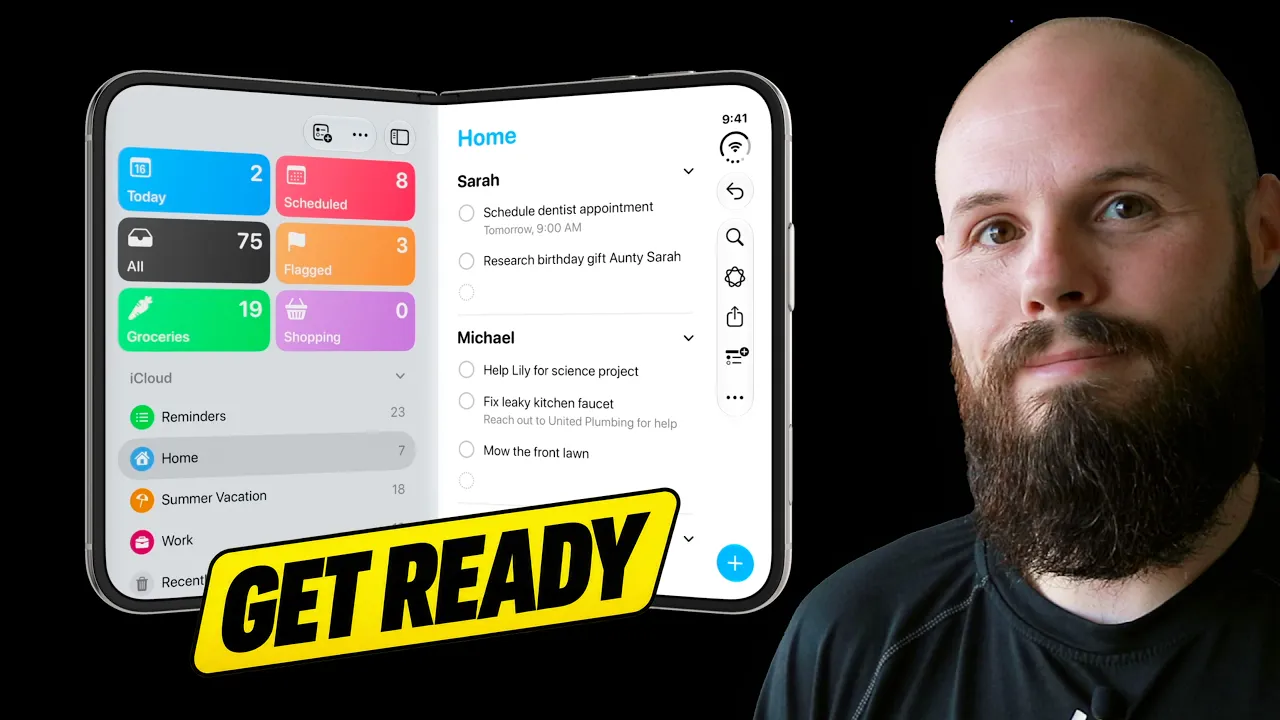
Apple’s foldable iPhone introduces an outer display, a larger inner display, and new ways to use apps as the device opens, closes, and folds. It's an entirely new iPhone experience.
For iPhone Duo app development, start with adaptive layouts, native navigation, safe areas, and multitasking. Then consider whether hinge-driven interactions would make your app more useful or more fun.
You don’t need to build a separate interface for every possible configuration. You need one app that adapts well. There’s a huge difference between stretching your iPhone interface across a larger display and making it feel like it belongs there.
How should your layout adapt to iPhone Duo?
Start with size classes, not a collection of pose-specific layouts.
A size class describes the available width or height as either compact or regular. In SwiftUI, you read these through the horizontalSizeClass and verticalSizeClass environment values. Compact width and compact height already exist on other iPhones, so this isn’t an entirely new layout system to learn.
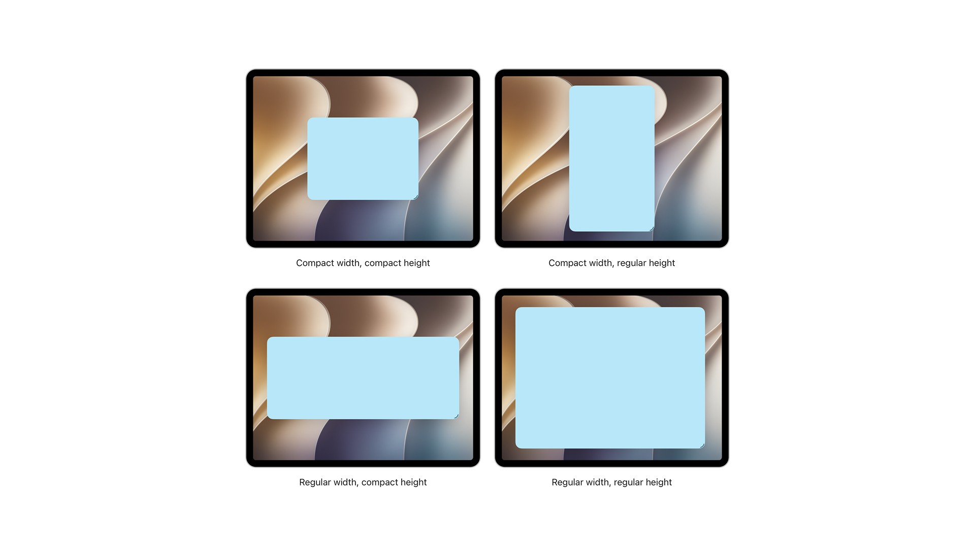
The important question is what your interface should do with the space it has. A compact layout might show one column. A wider layout might put related sections side by side.
For example, two sections that stack vertically on a typical iPhone could sit horizontally when there’s more room. A list and its detail view could appear together instead of requiring another navigation step. An information-dense app might benefit from a sidebar.
Apple’s design guidance for iPhone Duo emphasizes adapting your existing hierarchy rather than inventing a different app for each pose.
To put it simply, if your app is fully resizable and looks good no matter the orientation (landscape, portrait, large iPad screen), then you're most of the way there for iPhone Duo support. If your app isn't resizable on iPad, that's a great place to start while we wait for the iPhone Duo launch.
Do you need Xcode 27.1 and the iOS 27 SDK for iPhone Duo?
Xcode 27.1 beta and its iPhone Duo development support as releasing late September 2026. We're all waiting with bated breath for this beta to drop so we can get our apps ready.
Xcode is Apple’s development app. An SDK, or software development kit, provides the frameworks and APIs your app builds against. Our beginner’s guide to Xcode covers the basics.
Apple distinguishes between these SDK levels:
SDK used to build your app | iPhone Duo behavior |
|---|---|
Before iOS 27 | The app can run, but doesn’t take full advantage of the display. |
iOS 27 | Improved use of the inner display. |
iOS 27.1 | Edge-to-edge screen usage and vertical placement of standard navigation and toolbar buttons. |
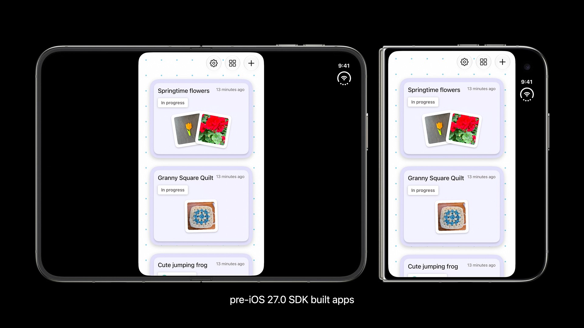
Building with iOS 27.1 is a starting point, but it isn’t the same as adopting the full behavior with the iPhone Duo APIs. Apple explains the distinction in Prepare your app for iPhone Duo.
Once available, use the Duo simulator in Device Hub to test opening, closing, rotating, and partially folding the device. Apple also describes an updated App Resizability agent skill in Xcode 27.1, with support for SwiftUI and iPhone Duo.
How do toolbars and tab bars change on iPhone Duo?
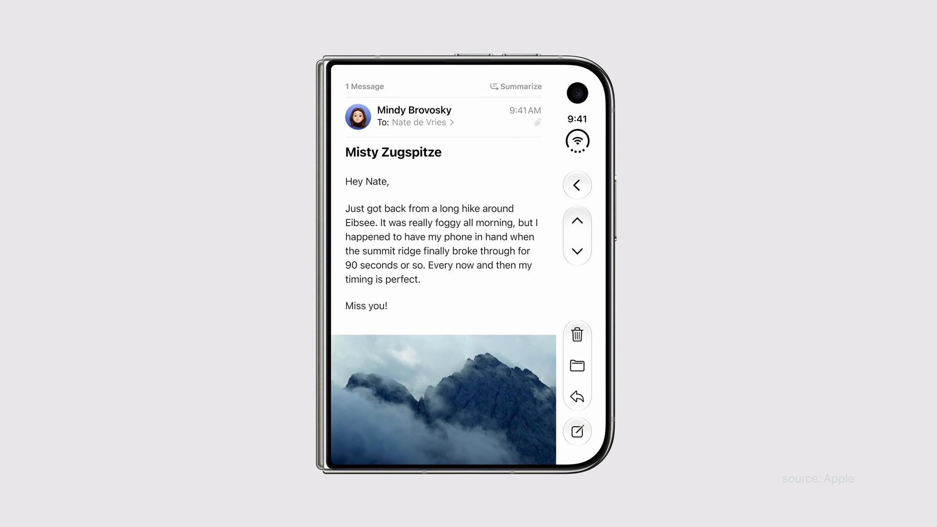
Toolbars can now show up vertically depending on the iPhone Duo pose. So, as I've been saying for years now… use the native components. You will get most of this functionality for free. If you have custom toolbars and tab bars then you've got a lot of work ahead of you. I recommend you take this time to switch to the native components.
In SwiftUI, that means NavigationStack, NavigationSplitView, TabView, and the built-in toolbar APIs. They let the system adapt navigation and controls instead of leaving you to recreate that behavior. You can learn more about navigation in the Human Interface Guidelines and in our guide.
On Duo, bars can move between horizontal and vertical layouts. The vertical area also accommodates system information, including the status bar and Live Activities, so space can get tight.
If you’ve built a custom tab bar, this is a good time to reconsider it. The same recommendation applies to getting Liquid Glass right: start with the system component before rebuilding something Apple already provides.
Give toolbar actions an icon and a title
The system can show just an icon in the vertical bar and then show title and icon when in the overflow menu. Using a SwiftUI Label gives the system the flexibility to determine which variation to show. Text-only controls generally remain horizontal because they need more width.
Decide what should stay visible
When the toolbar is vertical, it will be home to your top toolbar and bottom TabView(if you have both), so space can get tight. This is where the new ToolbarOverflowMenu comes in if you run out of space.
You can use toolbarVerticalCompressionBehavior to determine if the items in the toolbar or TabView go into the overflow menu first . Use visibilityPriority to prioritize individual items, and integrate custom overflow actions with ToolbarOverflowMenu.
Navigation actions such as Back belong above prominent actions, followed by secondary controls. Don’t let an infrequently used button push your main action into a menu.
Apple’s toolbar session also covers axisBehavior for placement preferences and toolbarVerticalBehavior for cases where vertical bars genuinely don’t suit the interface.
How do you keep content away from controls and the fold?
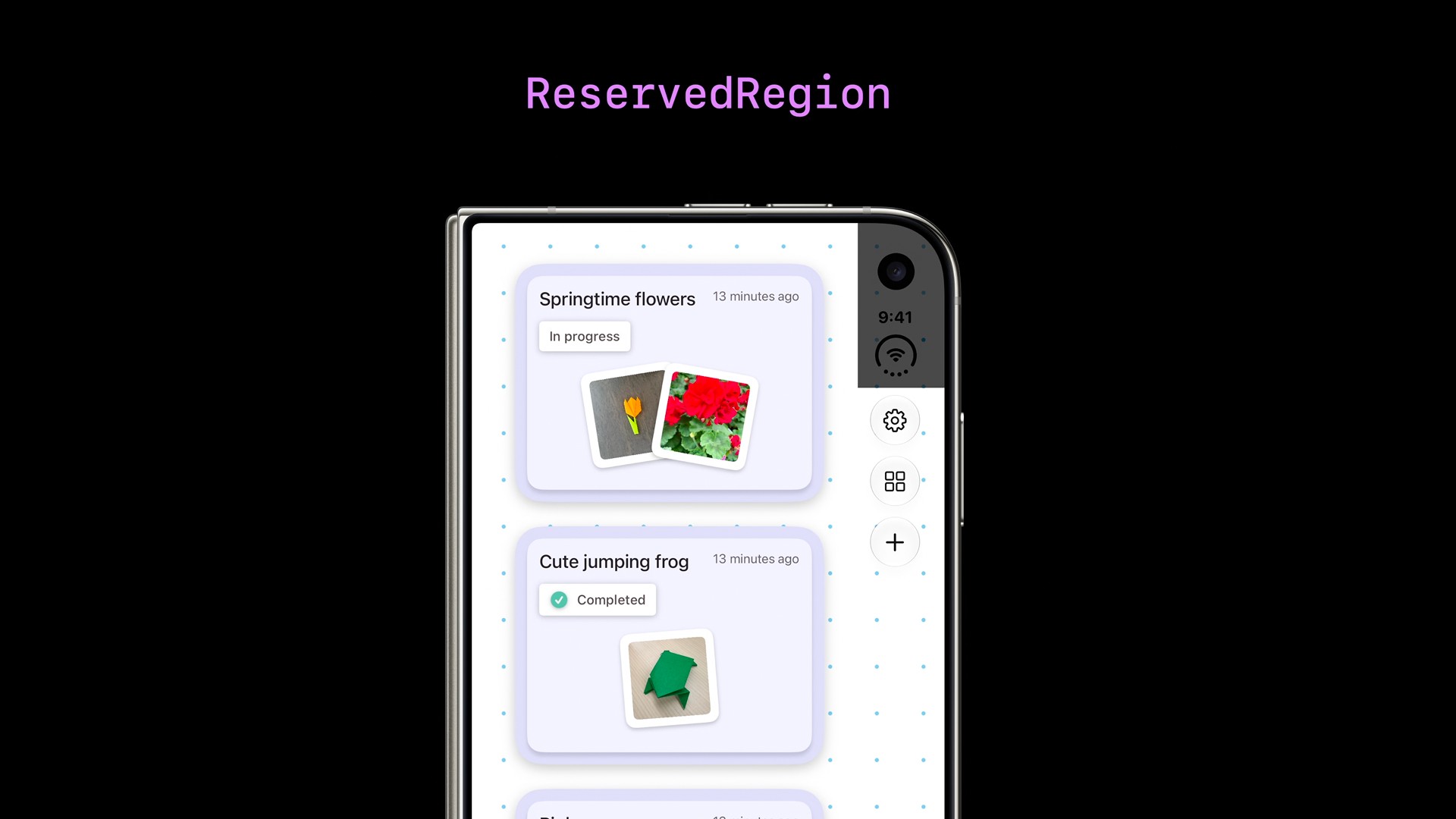
There are two related concepts to understand: safe areas and reserved regions. I recommend checking out the section in the YouTube video at the top of this article for this section. This is valuable stuff and seeing the moving visuals is really helpful to understand it.
Respect safe areas on every side
A safe area helps you position content where system interface elements won’t obscure it.
With controls along the side of Duo’s display, left and right insets matter just as much as top and bottom insets. Don’t assume opposite sides have equal spacing.
A background image can extend to the screen edges with ignoresSafeArea(). Your buttons, text, and scrolling content should still respect the appropriate safe area.
Think full-bleed background, readable foreground.
Use reserved regions for fold-aware layouts
Reserved regions describe areas your layout needs to accommodate. On Duo, .division regions represent the fold, while .occlusion regions represent camera-related obstructions.
A division region becomes active when the device is partially folded. Custom layouts can query region frames through APIs available from GeometryReader.
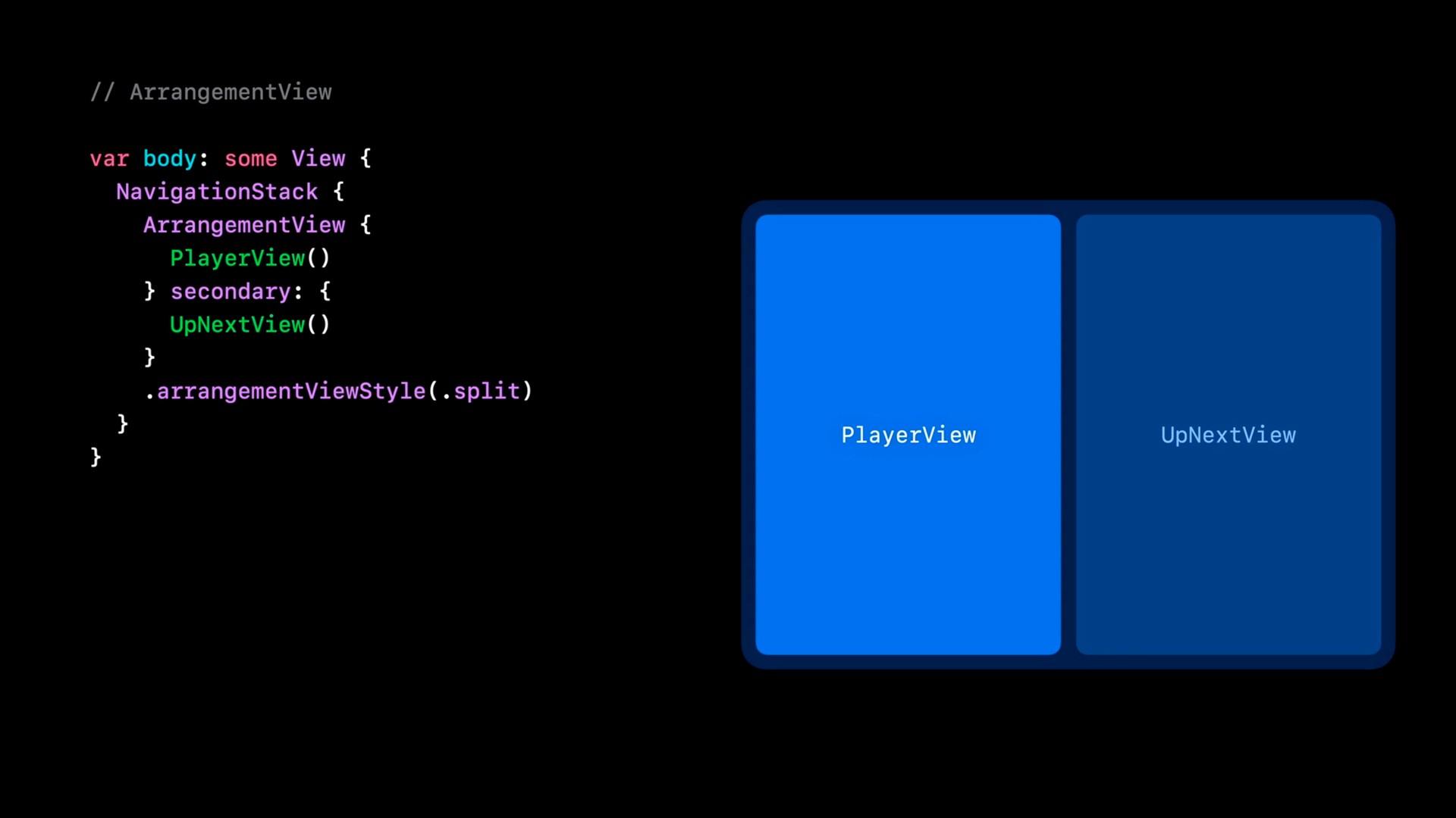
For custom two-part layouts, Apple introduces ArrangementView. Its split and overlay arrangements organize primary and secondary content based on available space and active division regions. You’re expressing how the views relate, rather than manually positioning them for every pose.
Use split arrangements when both parts should remain visible. Consider overlay arrangements when there’s a meaningful foreground-and-background relationship.
One important nuance: don’t force every interface into two panels. Apple specifically distinguishes continuously scrolling content, such as articles and feeds, from controls or containers that should move away from the fold. See Apple’s adaptive layout session for the different patterns.

What does iPhone Duo multitasking change for your app?
On iPhone Duo, your app can sit beside another app. The inner display also supports multiple windows of the same app when that app supports them. That means “it looks good when it fills the screen” isn’t enough.
Test narrow layouts. Consider whether users would benefit from opening two documents or comparing two pieces of content. Where it makes sense, support dragging content into and out of your app.
For a notes app, that might mean accepting text or images from another app without making someone copy, switch apps, and paste.
If you already have a genuinely adaptable iPad app, you’re starting from a better place. And I mean more than an iPhone interface that happens to launch on iPad.
The work you do on resizing, navigation, and multitasking can improve both experiences. There’s your two-for-one deal.
What can you do with the iPhone Duo hinge API?
The hinge isn’t just something to design around. It can also become an input for some really cool interactions or designs.
Apple’s onHingeChange modifier reports hinge status and continuous angle updates. In Apple’s guitar demonstration, moving the hinge changes the pitch, like using a whammy bar.
Not going to lie, that’s pretty cool.
But there’s an important distinction: hinge data is for interactions and effects. Layout should use the arrangement and reserved-region APIs. Apple makes this distinction in its hinge and multiple-scenes session.
Brainstorm what fits your app. Maybe it’s a playful interaction or an animation that responds to the device’s angle. Maybe your app doesn’t need a hinge feature at all.
Get the basic experience right before adding something clever.
What other features should you review?
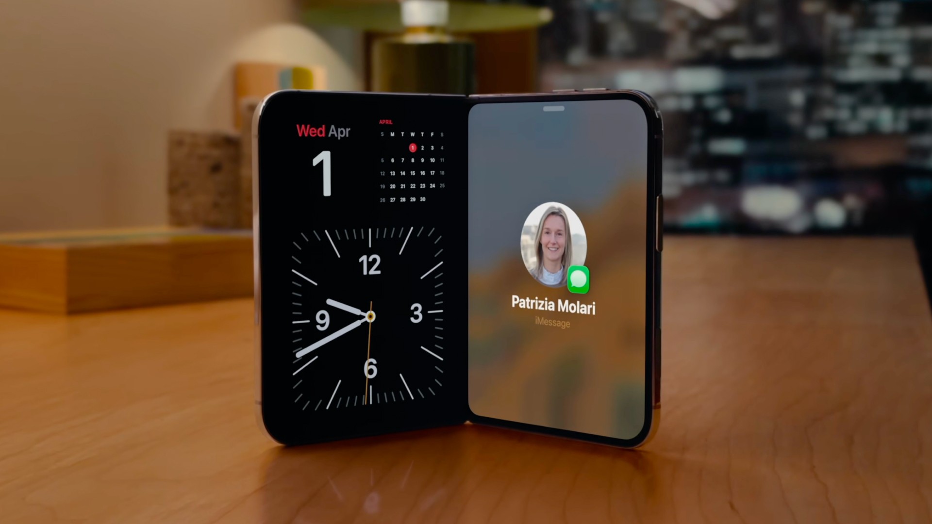
StandBy widgets. Apple has expanded StandBy on Duo, including use without charging. That’s a good reason to revisit your widgets and ask whether they work well as glanceable information.
Apple Pencil. Apple says support for Apple Pencil with USB-C is coming later in 2026. Drawing, handwriting, and annotation apps should review PencilKit and plan relevant experiences without assuming every Pencil model is supported.
Custom backgrounds. Review ConcentricRectangle when custom shapes should follow their container’s corners. Don’t assume every corner needs the same hard-coded radius.
Sheets and presentations. System sheets adapt their placement and controls across Duo’s poses. Test your presented content during transitions, not just when the device is sitting still.
Frequently asked questions
Do I have to rewrite a UIKit app in SwiftUI?
No. Apple provides UIKit support for these experiences too, including adaptive navigation controllers, reserved-region APIs, UIArrangementViewController, and UIHingeInteraction. Use the appropriate system components in your existing framework.
Does building with a newer SDK mean dropping older iOS versions?
Not automatically. The SDK you build against and your app’s minimum supported operating system are different settings. If you want to support the new iPhone Duo APIs and layouts while still supporting much older iOS versions, you'll need to do availability checks.
Can I avoid the layout work by keeping my app portrait-only?
Don’t rely on that. Apple says the inner display doesn’t honor supported interface orientations. Make layout decisions using size classes and available space rather than assuming an orientation restriction will protect a fixed interface.
What should I test beyond whether the interface fits?
Test real tasks during transitions. Open a sheet, start editing, select an item, or navigate several screens deep, then change the device’s configuration.
Check whether the user can continue what they were doing without losing context. A layout that fits is only the beginning.
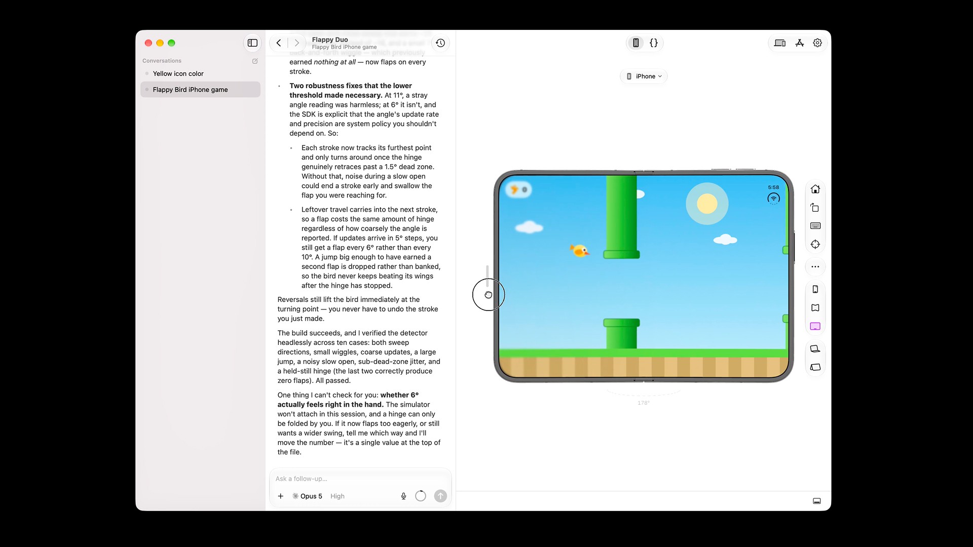
You can test your app today, in Bitrig with our 3D iPhone Duo simulator.
The bottom line on iPhone Duo app development
Start iPhone Duo app development with the work every user will notice: flexible layouts, native navigation, readable content, and reliable multitasking. You can get started on that right away by making sure your app is resizable and supports multitasking on an iPad.
Then add fold-aware refinements and hinge interactions where they genuinely improve the app. This is a process. Your first focus should be adapting to the sizes and poses on iPhone Duo and then you can iterate and polish the experience over time.

Try Bitrig
Bitrig is an AI development environment focused on building native Swift apps for Apple platforms. Because it specializes in Swift, SwiftUI, and Apple’s first-party frameworks, it has a deep understanding of how to adapt your app to the iPhone Duo. Try it out today!
Topics
Apple Platforms
Design

