Guides

In brief
Apple’s guidance for Liquid Glass in iOS 26: native SwiftUI controls, content hierarchy, tinting, concentricity, accessibility, and app icons.
Liquid Glass is easy to get wrong.
It's so tempting to use it on every button, card, list, and container in your app. But that’s the opposite of what Apple recommends.
The best way to use Liquid Glass is to let Apple’s native components do most of the work, keep glass primarily in your control and navigation layer, use color intentionally, maintain concentric geometry, and avoid stacking glass on top of glass.
Apple introduced Liquid Glass at WWDC 2025 as the new design language for iOS 26, iPadOS 26, macOS Tahoe, and the rest of the version-26 releases. It's a distinct visual layer for controls and navigation that floats above your app’s content.
If you’re building a SwiftUI app, following a few basic rules will get you most of the way there.
Liquid Glass best practices at a glance
Best practice | Do this | Avoid this |
|---|---|---|
Use native components | Use | Rebuilding standard controls as custom glass components |
Separate controls from content | Use Liquid Glass for navigation and controls floating above content | Making lists, cards, images, and content backgrounds glass |
Use color intentionally | Tint important actions or states | Applying your brand color to every control |
Maintain concentricity | Let nested rounded shapes follow the geometry around them | Giving every shape an unrelated corner radius |
Use Icon Composer | Build layered icons that can receive Liquid Glass treatments | Trying to manually fake every glass effect in your artwork |
Use native SwiftUI components whenever possible
The easiest way to get Liquid Glass right is to let Apple handle it.
Standard components from SwiftUI, UIKit, and AppKit automatically adopt the appropriate Liquid Glass appearance and behavior. Apple specifically recommends relying on system frameworks when adopting the new design.
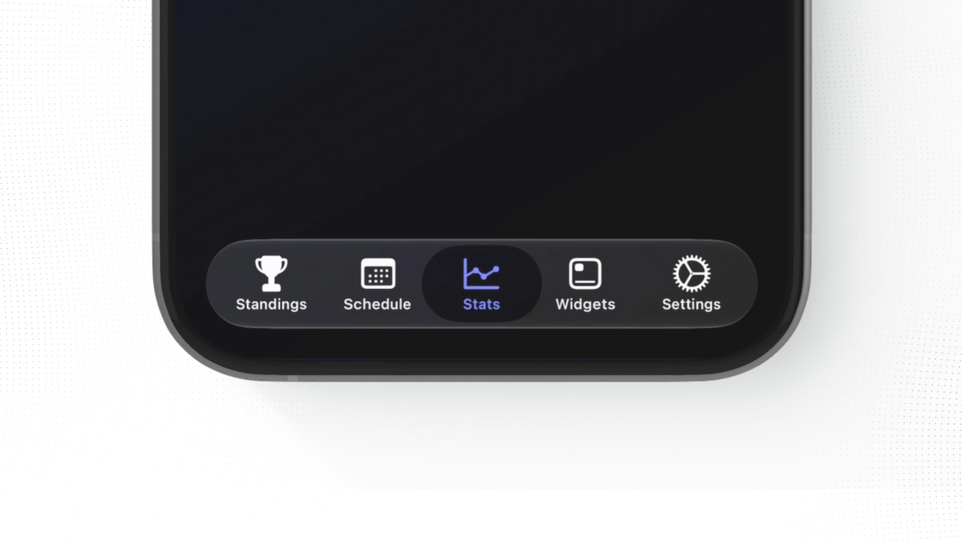
That means familiar components such as tab bars, toolbars, sheets, popovers, navigation elements, menus, and buttons should usually be your starting point.
If you’re new to the terminology, our Swift vs. SwiftUI guide explains how SwiftUI fits into the process of building an Apple app.
There’s another major advantage here besides appearance: system components already understand the platform.
Apple’s Liquid Glass material can respond to its surroundings to maintain separation and legibility. It also responds to accessibility settings such as Reduce Transparency, Increase Contrast, and Reduce Motion.
If you decide to build a completely custom imitation of an Apple control, you’re taking responsibility for much more than making it look glassy. You also have to think about interaction, animation, accessibility, contrast, platform differences, and how that component behaves as the system evolves.
If you genuinely need custom glass, use SwiftUI’s official glassEffect() modifier and GlassEffectContainer when several glass shapes need to blend rather than faking the look with blurs and materials.
Most beginners don’t need to do that. Start with the native component.
Be specific when prompting AI coding agents
This becomes especially important if you’re using an AI coding agent.
A vague prompt like:
Make the tab bar glassy.
can push an agent toward building a custom glass-looking component that you never needed.
A better instruction would be:
Use a native SwiftUI
TabViewfor our app's main navigation.
That gives the agent an architectural constraint instead of just describing how the finished UI should look.
The same idea applies throughout your app. Ask for native SwiftUI components first, then customize only when you actually have a reason.
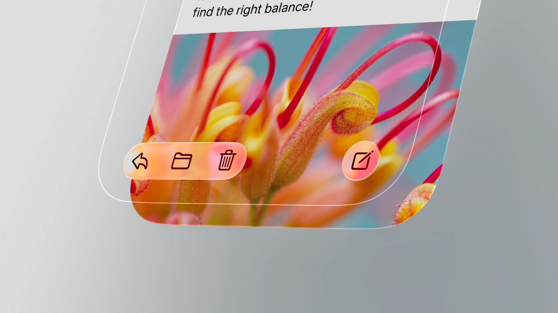
Keep Liquid Glass in the control layer
One of the most useful ways to think about your interface is as two layers: the content layer and the control layer.
UI layer | What belongs here | How Liquid Glass should be used |
Content layer | Text, photos, lists, maps, charts, documents, cards, videos | Usually avoid Liquid Glass. Let the content remain visually prominent. |
Control layer | Tab bars, toolbars, buttons, menus, navigation controls, search controls | This is where Liquid Glass primarily belongs, floating above the content. |
Liquid Glass primarily belongs in that control layer.
Apple’s Human Interface Guidelines for materials describe Liquid Glass as a functional layer for controls and navigation that floats above the content beneath it.
Learn more in our guide on the Human Interface Guidelines.
That distinction is important because Liquid Glass is translucent. The content underneath can remain visible while controls sit above it without completely covering the interface.
The content should still be the star of the show.
Avoid glass on glass
Another common mistake is stacking one glass element on top of another.
You make a glass container, put a glass button inside it, put that inside another glass card, and suddenly everything is competing for attention.
Apple specifically advises against layering Liquid Glass directly on top of Liquid Glass because it creates unnecessary visual complexity.
If you find yourself adding glass to the background of a card, then adding another glass control inside that card, stop and ask what role each element is actually serving.
For most app content, a normal background, standard material, color, image, or simple spacing will create better hierarchy.
Glass should communicate that something sits on the functional control layer. If everything is glass, that meaning disappears.
Use color sparingly with Liquid Glass
Liquid Glass controls are visually quiet by default, and that’s intentional.
Color is most effective when it means something.
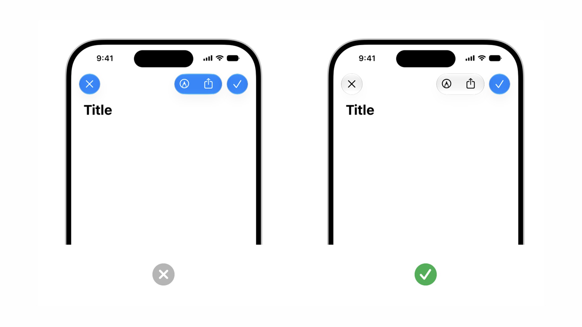
For example, you might tint the primary action on a screen so someone can quickly identify what to do next. Apple uses this idea throughout its own design guidance, where important actions such as Done can receive extra visual prominence while nearby controls remain neutral.
Apple’s guidance is straightforward: use tinting selectively to bring attention to important actions or states.
What you generally don’t want to do is color every glass control simply because your app’s brand color is blue, green, or purple.
If everything is emphasized, nothing is emphasized.
Your branding can still show up strongly in the content layer through illustrations, imagery, typography, charts, backgrounds, and other design choices.
Then you can use tint in the control layer when you actually want to direct attention somewhere. A useful rule is:
Use color because the control is important, not just because the color matches your brand.
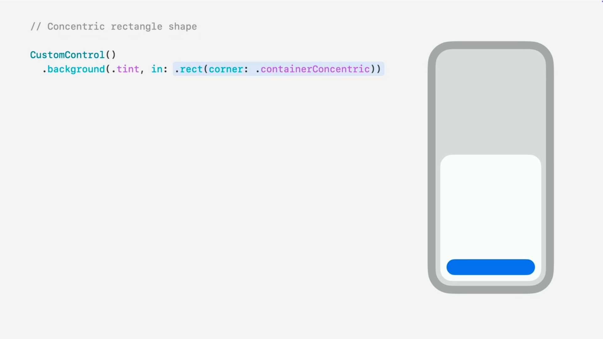
Use concentricity instead of random corner radii
Concentricity became a much bigger part of Apple’s design vocabulary with the introduction of Liquid Glass.
The basic idea is pretty simple.
When rounded shapes sit inside or near other rounded shapes, their curves should feel related. Instead of choosing an arbitrary corner radius for every rectangle, the geometry of one shape should respond to the shape surrounding it.
Imagine a large rounded card with a button positioned near the bottom corner.
If the outer card has one curve and the inner button uses a completely unrelated radius, the two shapes can feel slightly off even if you can’t immediately explain why.
When those shapes are concentric, their curves visually belong together.
Apple takes this even further by relating parts of the software interface to the physical curves of the device or window around them.
SwiftUI has an API for this
You don’t have to eyeball the geometry yourself.
SwiftUI includes ConcentricRectangle, a shape designed to derive concentric corners from its container.
So if you’re prompting an AI agent to build a custom layout, you can be very explicit:
Make the inner image frame concentric with its container using SwiftUI’s
ConcentricRectanglerather than hard-coding an unrelated corner radius.
That’s much more useful than simply asking the agent to “make the corners look better.”
You’re giving it the Apple concept and the native API to implement it.
Use Icon Composer for Liquid Glass app icons
Liquid Glass isn’t limited to the interface inside your app. Apple also redesigned how app icons can work.
Icon Composer is Apple’s tool for creating layered app icons that receive Liquid Glass effects such as translucency, refraction, highlights, and shadows.
Instead of manually baking all those effects into one flat image, you can bring your artwork into Icon Composer as layers and let the system apply the material.
A single Icon Composer file can represent your icon across iPhone, iPad, Mac, Apple Watch, and the App Store, with options for different appearances and platform-specific adjustments.
You don’t have to use Icon Composer for every app icon. Apple still supports traditional flattened artwork. But if you want to fully adopt the newer layered Liquid Glass icon treatment, Icon Composer is the tool designed for it.
We have a complete beginner guide on how to make a Liquid Glass app icon with Icon Composer if you want to go deeper.
A Liquid Glass checklist for your app
Before you ship, walk through your interface and ask:
Am I using native SwiftUI components anywhere a standard component already exists?
Is most of my Liquid Glass limited to controls and navigation?
Did I accidentally create glass backgrounds for normal content?
Is any Liquid Glass stacked unnecessarily on top of other Liquid Glass?
Am I using tint only when a control deserves extra attention?
Do nested rounded elements use concentric geometry?
Have I tested Reduce Transparency, Increase Contrast, and Reduce Motion?
If I’m using custom glass components, do they actually need to be custom?
Does my app icon fit with the current Apple platform design?
If you can answer those questions confidently, you’re probably in pretty good shape.
Frequently asked questions about Liquid Glass
Should I add Liquid Glass manually to every SwiftUI control?
No. In many cases you shouldn’t add anything manually.
Standard SwiftUI components adopt the system’s current appearance automatically. Start with the native component and only reach for custom Liquid Glass APIs when you have a specific design that the system components can’t provide.
Can I use Liquid Glass for cards and content backgrounds?
Generally, no.
Apple recommends keeping Liquid Glass out of the content layer because it can weaken the visual hierarchy between content and controls. Standard materials, colors, images, or normal backgrounds are usually better choices for content containers.
Interactive elements inside the content area can still use system control treatments where appropriate, but that doesn’t mean the entire content container needs to become glass.
Does Liquid Glass automatically support accessibility settings?
System Liquid Glass behavior responds to accessibility settings including Reduce Transparency, Increase Contrast, and Reduce Motion.
That’s another reason to prefer Apple’s native components and material APIs over manually drawing something that merely looks like glass.
You should still test your app with these settings enabled before shipping.
What is ConcentricRectangle in SwiftUI?
ConcentricRectangle is a SwiftUI shape that can derive its corner geometry from the surrounding container.
It’s useful when you have nested rounded interfaces such as controls inside sheets, cards, or other containers and want those curves to visually align rather than using unrelated fixed corner radii.
Do I need Icon Composer for a Liquid Glass app icon?
No. Apple still supports flattened app icons.
Icon Composer gives you more control over Apple’s layered Liquid Glass icon system, including material effects and multiple appearance modes. It’s a strong choice when you want your icon to fully participate in that design system.
The bottom line on Liquid Glass
The biggest Liquid Glass mistake is treating it like a visual effect that should be added everywhere.
It isn’t.
Think of Liquid Glass as a functional layer floating above your content. Let native SwiftUI components handle as much of it as possible, reserve custom glass for places that actually need it, avoid stacking glass on glass, use tint to create meaningful emphasis, and pay attention to concentricity.
Most importantly, let your content be the star of the show.
That approach will usually give you an app that feels much more at home on Apple platforms than trying to make every surface glassy.
Try Bitrig
When you're ready to ship, Bitrig builds native Swift and SwiftUI apps with AI and handles the App Store Connect side, including creating your app record, uploading builds, setting your release date, and submitting for review.
Topics
Design
SwiftUI
Apple Platforms

