Guides

In brief
iPhone Duo moves toolbars and tab bars between horizontal and vertical layouts as the available space changes. Learn how to control compression, overflow, and item placement so your app’s main actions stay easy to reach.
Your toolbar needs to adapt to the drastic difference in available space for each of the iPhone Duo poses. For example, when the iPhone Duo is open and in portrait mode, you have a ton of toolbar space. But when you close it and go into landscape, your toolbar space is very limited.
Apple gave us new toolbar APIs in iOS 27.1 so we can adapt to the changing available space. If you want to build a great iPhone Duo experience for your app, the toolbar is the first thing you should address.
Why do iPhone Duo toolbars move to the side?
A toolbar holds actions for the current screen, such as Save, Undo, or Share. A tab bar switches between your app's main sections.
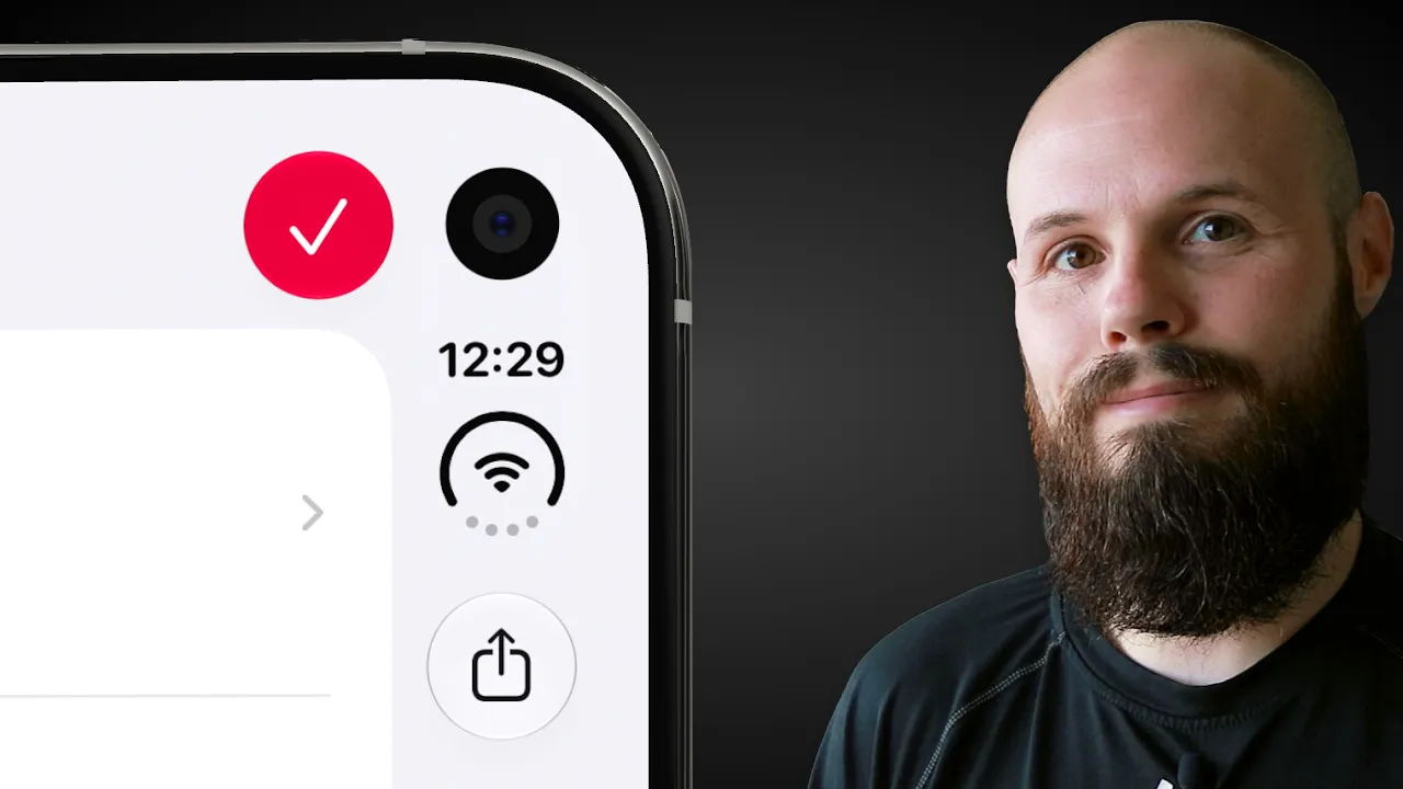
On iPhone Duo's inner display in portrait, these bars keep their familiar horizontal layout with the toolbar at the top and the tab bar on bottom. On the outer display and the inner display in landscape, navigation controls, toolbar actions, and tabs share a vertical region along the side.
That preserves height for your content. But on the outer display in landscape, the vertical region gets crowded quickly. Something's got to give.
Apple's iPhone Duo design guidance recommends adopting this layout, then refining it for your app's needs.
What do you need before using these toolbar APIs?
Start by building with the iOS 27.1 SDK or later. Use .toolbar with a system navigation container such as NavigationStack or NavigationSplitView, and use TabView for your tabs.
If you have custom toolbars or tab bars, now is a great time to reconsider if you can switch to the native components.
The vertical compression, axis behavior, and vertical bar opt-out APIs require iOS 27.1. The overflow menu and visibility priority APIs, including pinned trailing placement, arrived in iOS 27.
Let's take a look at each of these APIs, one by one.

How do you choose which bar compresses first?
The toolbarVerticalCompressionBehavior(_:) modifier controls whether toolbar actions or tabs receive priority when they share limited space.
The names describe what you want to keep visible, which is easy to mix up:
Value | Keeps visible longer | Compresses first |
|---|---|---|
| Toolbar actions | Tab bar |
| Tab bar destinations | Toolbar actions |
When the tab bar compresses, it collapses into a compact control. When the toolbar compresses, actions move into the overflow menu (see image above).
On iOS, the automatic behavior favors the tab bar. That makes sense when moving between sections is central to the screen.
But that's not always the case. For example, a drawing app has a different priority. While someone's drawing, they need quick access to their tools. Compressing the tab bar gives those tools more room:

You can choose this preference per view. Your drawing screen might prioritize tools, while the gallery prioritizes navigation. This doesn't guarantee that every toolbar action will fit. It tells the system which set of controls should give up space first.
How do you control the toolbar overflow menu?
The overflow menu holds actions that don't appear directly in the toolbar. The system represents it with an ellipsis button.
Use that system menu for overflow actions. If another menu in your toolbar also uses an ellipsis, give it a distinct symbol so people can tell them apart.

Put secondary actions in permanent overflow
ToolbarOverflowMenu lets you choose actions that always live in the overflow menu, even when the toolbar has plenty of room.
That makes it useful for secondary actions. In a drawing app, Export might belong there if people use it occasionally, while Undo deserves a visible button.
Other toolbar items can move into the same system menu as space runs out. By default, vertical items overflow from bottom to top, but you can change their priorities with the modifiers explained below.
Pin the screen's primary action
Use .topBarPinnedTrailing for a prominent action such as Save, Done, or Share.
Choose the action that matters most on that screen. A drawing editor might prioritize Save; a document preview might prioritize Share.
Pinned placement provides stronger protection than an ordinary high visibility priority. Apple documents one exception: a pinned item can move into overflow when search is active and there isn't enough room.
Set visibility priorities for other actions
Use .visibilityPriority(_:) on a ToolbarItem or ToolbarItemGroup to influence which actions overflow first.
.highkeeps frequently used actions visible longer..lowlets less important actions move into overflow earlier.
A low-priority action can still appear in the toolbar when there's room. An action inside ToolbarOverflowMenu stays in the menu.
Here's how those roles might look inside your screen's toolbar:
Notice that .visibilityPriority(.high) applies to the ToolbarItem, outside the button.
Don't give everything high priority. Think about what people use repeatedly while completing the task, and let occasional actions take the extra tap.
When should a toolbar item stay horizontal?
The system considers an item's content when deciding which axis to use. Standard buttons with symbols can move into the vertical bar. Text-only buttons stay horizontal.
Use SwiftUI's Label to provide both a title and a symbol, as in the example above. The system can show the symbol in the toolbar and use the title alongside it in the overflow menu.
For exceptions, axisBehavior(_:) gives you two useful options:
.horizontalOnlyrestricts an item to horizontal bars. Use it when meaningful text or a related group of controls needs that layout..verticalPreferredallows both axes and favors the vertical bar when both are available. Use it for a custom control that fits the vertical bar well.
For example, a compact compass is a good candidate:

Make sure the custom view actually fits the bar's width. The modifier expresses a placement preference; it doesn't redesign your view.
There's also a visibility detail to watch: an item marked .horizontalOnly isn't shown if no horizontal bar exists. Check that the action remains available in the layouts your app supports.
For most buttons, start with the automatic behavior and only override it for a clear usability reason.
Can you disable vertical toolbars?
Yes. Apply .toolbarVerticalBehavior(.disabled) to your view to opt out. Bar content falls back to the standard horizontal top and bottom bars.
This is an escape hatch for layouts that work better that way. Apple's Calculator example makes sense: a single screen with a grid of controls can benefit from using the full width.

Most apps should keep the vertical layout. If your problem is that an important action disappears, adjust compression or priority first.
Apple also recommends treating this as a stable layout choice. Avoid repeatedly switching vertical bars on and off as someone navigates or changes a view's state.
What should you test before shipping?
Run through your app's main tasks while changing the device's pose, meaning how it's opened, folded, and oriented. I'd check:
Both displays and orientations. Open and closed, portrait and landscape, plus transitions through partially folded positions.
Your busiest screens. Confirm that frequently used actions receive the intended priority.
The overflow menu. Check that actions have useful titles and remain easy to find.
Search and the keyboard. Where your app uses them, check how the toolbar adapts when they appear.
Custom controls. Look for clipped content, awkward spacing, and controls that don't fit the vertical bar.
Larger text and accessibility labels. Make sure actions remain understandable when they're displayed as symbols.
Also check that a person can still complete the same task after folding or rotating the device. A layout can look tidy while making a common action unnecessarily hard to reach.
For the broader layout work, see our guide to ArrangementView.
Frequently asked questions
Can my app still support older iOS versions?
Yes. Building with a newer SDK is separate from choosing your app's minimum supported iOS version. If you support older releases, use availability checks and appropriate fallback behavior around APIs those releases don't provide.
Why do some split-view controls stay horizontal?
In a split view, the detail column participates in the vertical bar when its container is along the display edge. Controls for other columns remain with their content. A sidebar's controls don't need to join the detail view's toolbar.
Apple explains these container rules in Raise the bar with iPhone Duo.
Will a custom row of buttons adapt automatically?
A row of buttons you've built as ordinary view content doesn't automatically become a system toolbar. For toolbar actions, prefer ToolbarItem and ToolbarItemGroup inside .toolbar with a standard navigation container. That gives the system the information it needs to manage placement and overflow.
Make iPhone Duo toolbars match the task
For most apps, start with the standard vertical layout, protect the screen's primary action, and choose compression based on what people are doing. Put occasional actions in overflow, then test iPhone Duo toolbars across the layouts your app supports.

Try Bitrig
Bitrig helps you build native Swift apps with AI. Its 3D iPhone Duo simulator lets you fold and rotate the device so you can make sure you have a great toolbar experience. Try it with your busiest screen and make sure the actions people need stay easy to reach.
Topics
SwiftUI
Apple Platforms
Swift

