Guides

In brief
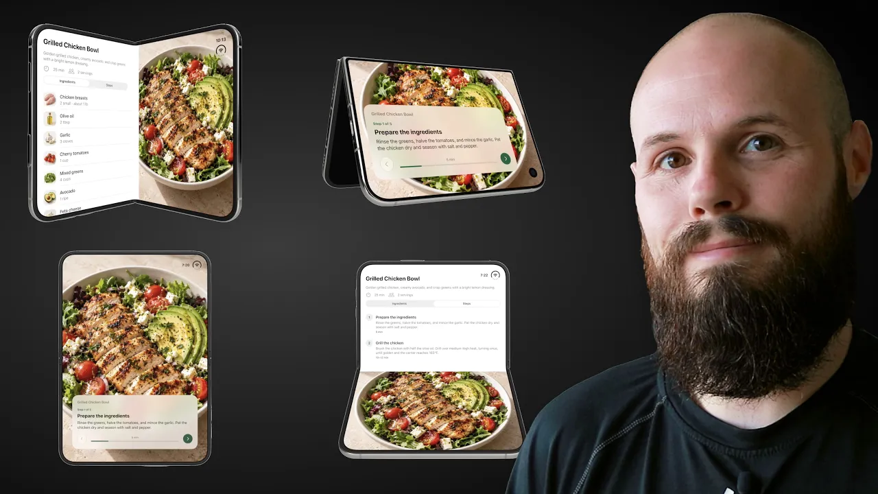
SwiftUI ArrangementView helps two related views adapt as people open, fold, and close iPhone Duo. Learn when to use split or overlay layouts, how to give important content more room, and when to hide optional content.
SwiftUI ArrangementView automatically lays out two related views as the available space changes. You provide a primary view and a secondary view, then choose a split or overlay style. SwiftUI adapts its placement to the layout environment, including the fold on iPhone Duo.
That means you don't have to write separate layout logic for every pose. You decide what deserves space, what can disappear, and how the content should look when its layout changes and then ArrangementView does the rest.
The ArrangementView API is available on iOS 27.1 and later and this guide covers its split and overlay styles using Apple’s documentation as of November 2026.
When should you use SwiftUI ArrangementView?
Use ArrangementView when two pieces of content belong together on the same screen, but their placement needs to adapt.
In our recipe example, the ingredients and instructions are the primary content. A photo of the finished meal is the secondary content. Both belong to the same recipe, but they don’t need equal space in every layout.
The two styles support different relationships:
Style | How it arranges content | When it fits |
|---|---|---|
Split | Gives the views separate areas, horizontally or vertically | Both views should remain unobscured when displayed together |
Overlay | Places the primary view over the secondary view on a flat display, then separates them around an active fold | The views have a foreground and background relationship |
ArrangementView handles the content’s layout. For a recipe list that opens individual recipe screens, use a navigation container such as NavigationStack or NavigationSplitView.
An ArrangementView can sit inside a NavigationStack to organize a recipe screen. It doesn’t manage navigation history or replace your app’s navigation structure. Apple demonstrates this setup in its adaptive layouts talk.

How do you create a split ArrangementView?
Start by providing your two views and applying the split style:
A split arrangement generally places its views side by side when its area is wider than it is tall, and stacks them vertically when it’s taller than it is wide. Size classes and reserved regions also affect the result.
A reserved region is an area the interface needs to accommodate, such as the fold dividing the Duo’s inner display. Apple explains these regions in its iPhone Duo design guidance.
Avoid assuming “open means horizontal” and “closed means vertical.” The actual environment matters. For example, Apple documents that a split arrangement shows only its primary view on a closed Duo in landscape.
So that's the default behavior. But we can make some customizations and adjustments to dial in an ArrangementView to be what we need for our UI.

How do you change the split ratio?
Do the instructions and photo really need the same amount of space? In this app, I’d rather give the recipe more room.
Apply splitArrangementLayoutRatio(_:) to the primary view:
A value of 0.65 requests about 65% of the available space for the recipe, leaving about 35% for the photo when that preference can be honored.
This is a preferred ratio, not a fixed frame. Available space and layout priorities affect the result, and the arrangement still needs to accommodate the fold. Don’t assume the same percentages will hold in every pose.
How do you adapt content to the split direction?
A summary row with cooking time and serving information might look great beside the photo but feel cramped when the views stack vertically when the iPhone Duo is closed and in portrait.
The splitArrangementAxis environment value lets a child view read the current split direction (horizontal or vertical):
Here, the extra summary appears only in a horizontal arrangement when there is plenty of vertical space. When the views are split vertically, it is not shown because vertical screen real estate is limited.
The value describes the arrangement’s axis, rather than directly telling you whether the phone is open or closed. Read it inside the content that ArrangementView is arranging.
With this API, you can make adjustments to your UI based on whether the views are split horizontally or vertically.

How do you hide optional secondary content?
Even with a smaller photo, a vertically stacked recipe screen might still feel crowded. Personally, I’d rather see more instructions. Restrict the split style to the horizontal axis:
When the layout would use an unsupported vertical split (like when the iPhone Duo is closed and in portrait), the arrangement displays only its primary view. The recipe stays visible and the photo disappears. This behavior is documented in Apple’s split arrangement reference.
That’s a useful option when the secondary view is optional. A decorative food photo can disappear without stopping someone from following the recipe. An essential action or the only copy of the ingredient list needs to remain accessible.

How does the overlay style work?
An overlay arrangement fits a screen with a clear foreground and background, such as a recipe card floating over a food photo.
The setup is similar:
Here’s the easy detail to get backward: the primary view is the foreground view. The secondary view goes behind it, even if the background takes up most of the screen.
With the default overlay style, a flat display shows the primary view over the secondary view. This includes the Duo’s fully open inner display and its closed outer display.
When the inner display is partially folded, the views separate around the fold. In landscape, they sit beside each other. In portrait, one sits above the other.

But is this really what we want? Of course this depends on your UI, but in the example above our primary view is a small card. So that looks weird when it gets an entire side of the fold by itself. Don't worry. We can fix this.
How do you expand an overlay when the views separate?
The overlayArrangementZIndex environment value reports a view’s position in the arrangement’s stacking order.
Read it inside the primary view to switch between compact and expanded presentations:
This follows the pattern in Apple’s example: when the primary view’s z-index is greater than zero, it’s overlaid, so show the compact version. When the views separate, use the expanded version.
The z-index belongs to the individual view. It isn’t a general fold detector, and reading it from the background view doesn’t give you the same test.

For our recipe app, the compact version might offer a short summary and access to the recipe. The expanded version can make better use of its region by showing more details. Keep the same functionality available in both presentations.
What happens if you restrict overlay axes?
Overlay arrangements also support axis restrictions:
Choose this carefully. Apple’s current overlay axes documentation says that excluded axes display only the primary view.
That means you shouldn’t rely on this modifier to keep both views overlaid when the layout would otherwise separate horizontally.
For this recipe design, I’d keep the default axes and adapt the foreground content with overlayArrangementZIndex. That preserves the photo while giving the recipe a presentation that suits its new space.
What should you test before shipping?
Once the layout works, walk through the ways someone will actually use it:
Open, partially folded, and closed: Check both portrait and landscape where your app supports them.
Essential content: Make sure ingredients, instructions, and important actions remain accessible when secondary content disappears.
The fold: Check that important text and controls stay visible and comfortable to use.
Compact and expanded overlays: Confirm both presentations are useful and preserve the same functionality.
Different content sizes: Try longer recipes and larger text settings, not just the shortest sample.
For broader design principles, our guide to Apple’s Human Interface Guidelines is a useful next step.
Frequently asked questions
Is ArrangementView only for iPhone Duo?
No. ArrangementView also adapts to flat displays, and Apple documents availability across its platforms. On iPhone and iPad, it requires iOS 27.1 or iPadOS 27.1 and later. You can use it for the same related content across supported devices without making the layout exclusive to Duo.
Do I need to calculate the fold angle myself?
For the standard split and overlay behaviors shown here, no. ArrangementView responds to its layout environment. More specialized layouts may need additional customization, but start with the built-in styles before adding your own fold-related logic.
Can I put ArrangementView inside a ScrollView?
Apple advises against placing ArrangementView inside scrolling containers such as ScrollView or List. Let the arrangement organize the screen’s main content regions, then make the content within a region scroll when needed. Apple discusses this distinction in its adaptive layouts talk.
Make the layout fit the content
If your screen has two related views, SwiftUI ArrangementView gives you a useful starting point. Choose split when the views need separate space, or overlay when they have a foreground and background relationship. Then adjust the content that feels cramped or wastes space.
You don’t need a completely different screen for every pose. You need a few thoughtful decisions about what matters in each layout.

Try Bitrig
If you’re building with AI, try Bitrig. It helps you build native Swift apps, and its 3D simulator lets you explore iPhone Duo in different poses. Start with one screen and check how it feels as you open, fold, and close the device.
Topics
SwiftUI

