Guides

In brief
Learn how Icon Composer turns simple layered artwork into a polished Liquid Glass app icon, with practical design tips for iPhone, iPad, Mac, and Apple Watch.
You don’t need to be a professional designer to make an app icon that feels at home on Apple platforms. Apple’s Icon Composer handles much of the Liquid Glass styling for you.
To make a Liquid Glass app icon, start with simple, flat artwork divided into layers. Import those layers into Icon Composer, arrange them into groups, adjust the material and appearance settings, preview the result across platforms, then save a single .icon file and add it to Xcode.
That file can adapt your design for iPhone, iPad, Mac, and Apple Watch. Instead of manually creating every size and baking highlights, shadows, and translucent effects into one flattened image, you give Icon Composer the basic pieces and let Apple’s rendering system do the glassy work.
Check out our guide on Liquid Glass design best practices for your app.
What is Icon Composer?
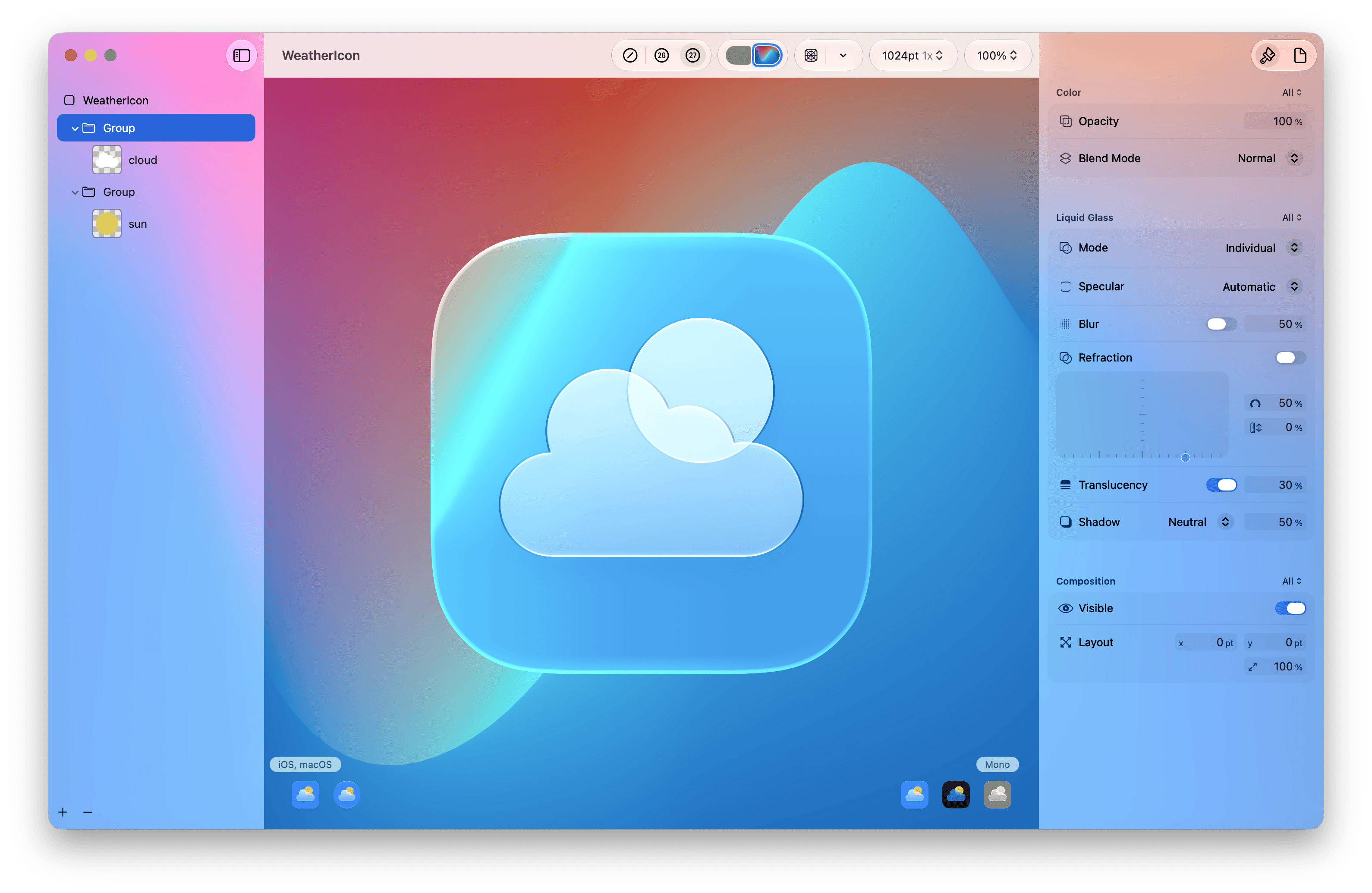
Icon Composer is Apple’s app icon design tool for creating layered icons that use Liquid Glass.
It doesn’t fully replace Figma, Sketch, Photoshop, Illustrator, or another design tool. You still use one of those tools to create the basic artwork. Icon Composer is the final step, where you assemble the layers, add material properties, and preview how the icon adapts to different platforms and appearances.
The basic workflow is:
Create flat artwork in your preferred design tool.
Export the individual visual layers.
Import the layers into Icon Composer.
Adjust the composition, glass styling, and appearance variants.
Save the result as an
.iconfile.Add the file to your Xcode project.
Apple provides official Icon Composer documentation and a detailed WWDC session about the workflow.
Icon Composer vs. a traditional app icon
Icon Composer changes where the final visual effects are created.
Traditional app icon | Icon Composer app icon | |
|---|---|---|
Source artwork | Usually a flattened image | Separate visual layers |
Glass effects | Baked into the artwork or applied automatically | Configured with live material controls |
Appearance variants | Separate assets or automatic treatment | Default, Dark, and Mono annotations in one file |
Platform previews | Checked separately | Previewed inside one tool |
Best fit | Detailed or illustrative artwork | Simple, graphic, layered artwork |
Xcode delivery | Asset catalog | A single |
Icon Composer is usually a strong fit when your icon has a clear symbol, a few bold shapes, and layers that make sense in depth. A detailed illustration can still work better as a traditional flattened image.
What should you prepare before using Icon Composer?
Start with simple, recognizable shapes
A good app icon needs to remain understandable when it’s tiny. Build it around one recognizable idea, such as a cloud and sun for a weather app or a checkmark for a task app.
Avoid filling the icon with small details, long text, or several competing symbols. Liquid Glass adds depth and movement, so the underlying design benefits from being simpler.
Use SVG layers when possible
Apple recommends vector artwork for flat graphics because it scales cleanly. SVG is a strong choice for symbols, logos, and basic shapes.
PNG is still useful for raster artwork, textures, custom gradients, or elements that can’t be represented well as vectors. Export PNG layers with transparent backgrounds.
Apple also provides app icon templates and design resources for common design tools.
Separate artwork by visual depth
Each layer should represent a meaningful piece of the design. If a cloud belongs in front of a sun, those should probably be separate layers. If two colors need different appearance adjustments, separating them gives you more control.
Icon Composer organizes layers into groups, and Liquid Glass properties apply at the group level. Create layers when they help describe depth, color, or a distinct visual element, not simply because the tool allows them.
How do you use Icon Composer?
This isn’t a button-by-button tutorial, but the process is straightforward. You can watch me demonstrate this in the YouTube video at the top of this article.
1. Open Icon Composer
In a current version of Xcode, choose Xcode > Open Developer Tool > Icon Composer. You can also open the app with Spotlight.
2. Import and arrange your layers
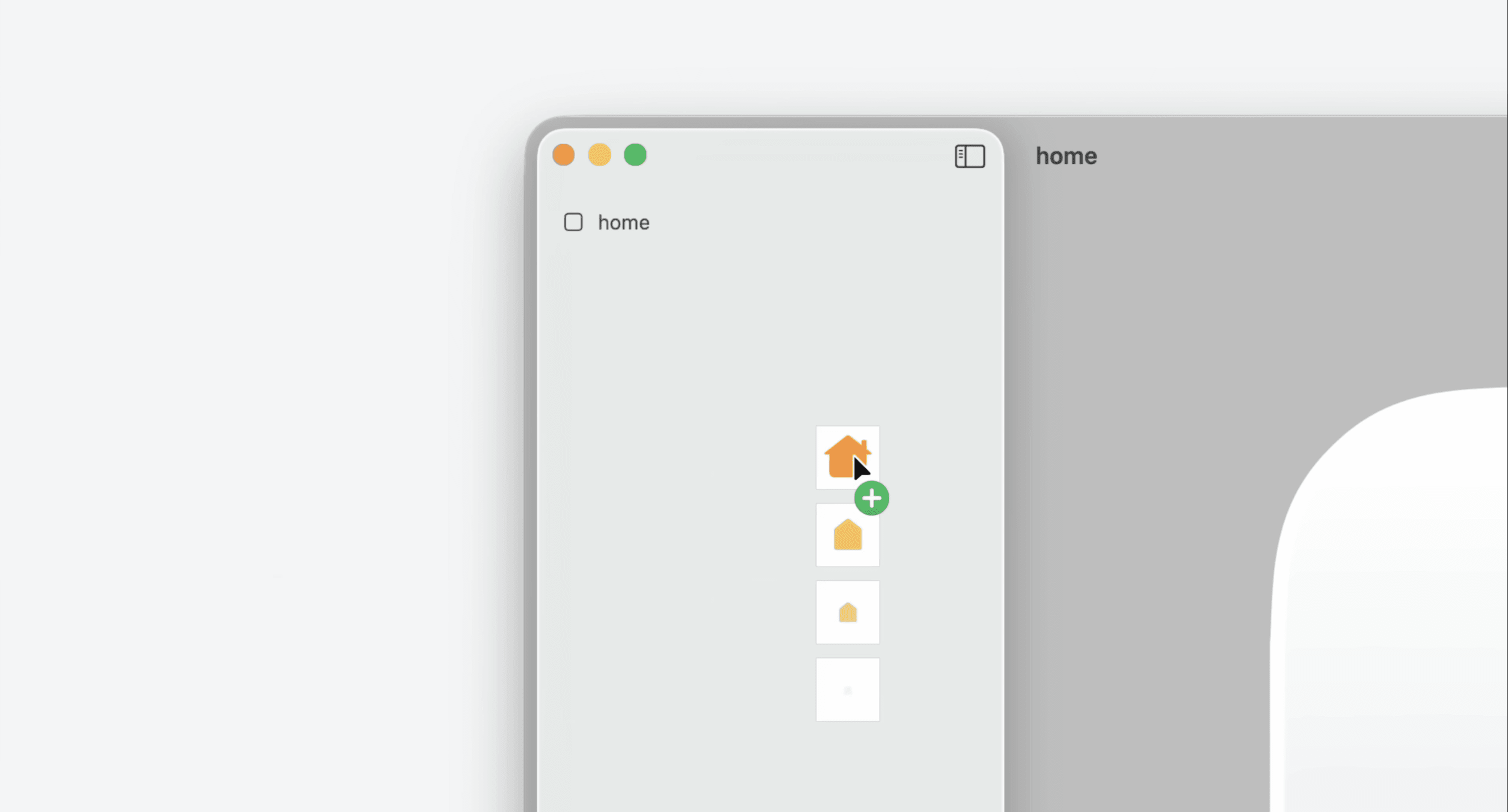
Drag each SVG or PNG into the document and place it in the appropriate group. The group order controls visual depth, with background elements behind foreground elements.
Move and resize the artwork until the composition feels balanced. Turn on the grids to check alignment and the safe area for different enclosure shapes.
Pay special attention to the circular Apple Watch preview. A design that fills an iPhone’s rounded rectangle may feel cramped inside a circle, so leave some breathing room.
3. Style the Liquid Glass material
Imported groups receive Liquid Glass styling by default. You can adjust each group independently or disable the glass treatment for an element that should remain flat.
Depending on the Icon Composer version, controls can include:
Fill colors and gradients
Opacity
Blur
Shadows
Specular highlights
Refraction and other glass behavior
Don’t turn every effect up. Add enough depth to make the icon feel polished without making the symbol harder to recognize.
4. Preview every appearance
As of 2026, Icon Composer 2 organizes appearance annotations into Default, Dark, and Mono. The Mono annotation supports clear and tinted icon variants.
Test each appearance against several wallpapers and background colors. An icon that looks great on a plain dark background may lose contrast against a bright or colorful wallpaper.
5. Preview the supported platforms
One design can serve iPhone, iPad, Mac, and Apple Watch, but you can customize it when a platform needs a different composition.
Check that the symbol remains centered, balanced, and recognizable in each enclosure.
6. Save the icon and add it to Xcode
Save the document to create the .icon file. Drag it into the Xcode project as a normal resource and confirm that it belongs to the correct target.
Select the app target and set the App Icon field to the icon file’s name. Then build and run the app so you can judge the result on an actual Home Screen.
If something feels off, open the icon file from Xcode, adjust it in Icon Composer, and build again.
Liquid Glass app icon best practices
Let Icon Composer create the effects
Keep the source layers flat, simple, and mostly opaque. Don’t bake in heavy shadows, bevels, reflections, or glass effects before importing them.
Those effects can conflict with the system material and make the icon look muddy. Give Icon Composer clean artwork so its lighting and materials have something predictable to work with.
Design for recognition before decoration
A fancy glass effect won’t save an icon that nobody understands. Make sure the silhouette and main symbol are recognizable first, then add depth.
Regularly preview the icon at the size people will actually see. Thin lines, subtle gradients, and small text can disappear quickly.
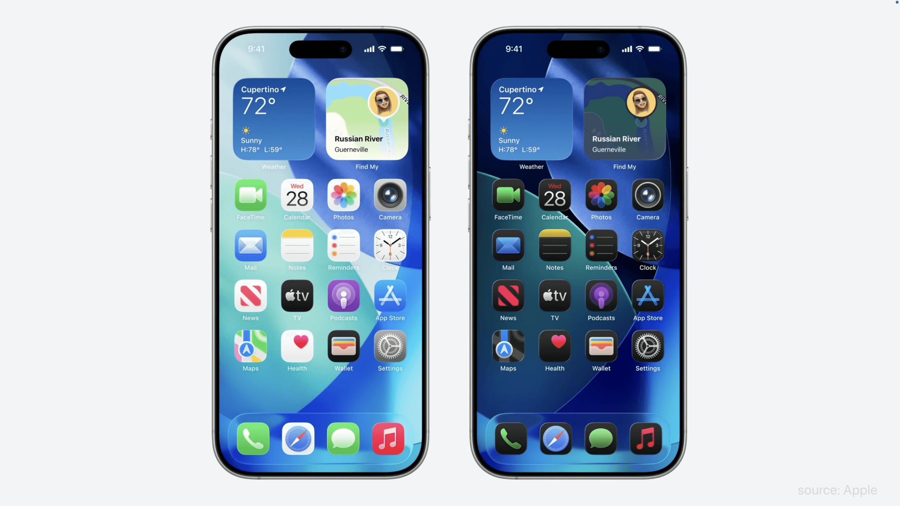
Check every appearance and background
Test Default, Dark, and Mono, along with clear and tinted previews. Try light, dark, neutral, and colorful backgrounds.
You’re not trying to make every version identical. You’re trying to preserve the same identity and level of legibility.
Use transparency carefully
Liquid Glass can create beautiful translucent layers, but too much transparency weakens contrast. The wallpaper behind the icon changes from user to user, so transparent elements need to remain readable in many environments.
A little restraint usually produces a more premium result than making every layer as clear as possible.
Test on a real device
The preview is helpful, but the Home Screen is the final test. Install the app and look at the icon next to other apps.
Ask yourself:
Is the main symbol obvious?
Does the icon stand out for the right reasons?
Does the design feel too busy?
Does it still work in dark, clear, and tinted appearances?
Does it look consistent with the app itself?
Your first attempt probably won’t be the final one. That’s normal. App icon design is an iterative process.
Designing for iOS 26 and beyond
Icon Composer arrived with Apple’s Liquid Glass redesign for iOS 26 and continued evolving for iOS 27.
If you created an icon with an earlier version, open it in the latest Icon Composer and review the updated rendering. New system versions can change highlights, shadows, translucency, and refraction even when the underlying artwork stays the same.
When your app supports multiple operating system versions, use Icon Composer’s version previews and check the design in each one. Keeping the original layered .icon file also makes future adjustments much easier.
When should you skip Icon Composer?
Icon Composer isn’t mandatory.
If your app icon is highly illustrative, photographic, or dependent on detailed textures, a traditional image asset may preserve the design better. Apple can still apply the system’s enclosure and edge treatment to a conventional icon.
Use Icon Composer when the design benefits from separate layers and adaptive materials. Use a flattened icon when the artwork needs to remain exactly as rendered.
The best choice is the one that keeps your icon clear and recognizable.
Liquid Glass app icon checklist
Before shipping, check that:
The icon communicates one clear idea.
The source artwork is simple and readable.
Vector layers are used where practical.
Glass effects aren’t baked into the source files.
Groups represent meaningful depth or color differences.
The design has enough breathing room.
The circular Apple Watch preview looks correct.
Default, Dark, and Mono appearances are legible.
Clear and tinted previews preserve the icon’s identity.
The icon has been tested on multiple backgrounds.
The icon has been viewed at a small size and on a real device.
The Xcode target points to the correct
.iconfile.
Frequently asked questions
Is Icon Composer required for iOS 26 app icons?
No. You can continue using a traditional app icon in an asset catalog. Icon Composer gives you more control over layered Liquid Glass styling and adaptive appearances, but it isn’t required for every design.
Do I need separate light, dark, and tinted icon files?
No. Icon Composer uses one layered document and lets you annotate how the artwork should appear in Default, Dark, and Mono modes. The Mono configuration supports clear and tinted variants.
Can I use PNG files in Icon Composer?
Yes. SVG is usually best for simple vector shapes, while PNG works for raster elements, textures, custom gradients, and artwork that doesn’t translate cleanly to vectors.
Does Icon Composer support Apple Vision Pro?
Apple’s current Icon Composer documentation lists iPhone, iPad, Mac, and Apple Watch as the supported platforms. visionOS app icons follow separate platform requirements.
Can I edit an icon after adding it to Xcode?
Yes. Select the .icon file in Xcode and open it with Icon Composer. Save your changes, rebuild the app, and check the updated result.
Does my app icon affect App Store Optimization?
The icon isn’t a keyword-ranking field, but it can influence whether people choose your app after seeing it. A clear, polished icon supports product-page conversion, which is an important part of App Store Optimization.
The bottom line
The easiest way to make a Liquid Glass app icon is to keep the source artwork simple, divide it into meaningful layers, and let Icon Composer handle the materials and adaptive appearances.
You don’t need to manually recreate Apple’s glass effects or export a pile of icon sizes. Focus on a recognizable symbol, test it across platforms and appearance modes, and keep refining it until it looks good on a real Home Screen.

Try Bitrig
If you’re building a native Swift app with AI, Bitrig can help you move from an idea to a working Apple-platform app. Once your .icon file is ready, you can give it to Bitrig and ask it to set up the app icon in your project.
Topics
Design
App Store